1. Verdict & headline findings
The proposed system is a genuine improvement on colour discipline and accessibility, but it is a page-redesign deck, not a complete design system. It cannot be implemented against the existing flexipage content model without decisions it does not make.
What it gets right. Documented tokens with hex/RGB/HSL, WCAG AA reasoning per pair, a 4pt spacing scale, a full type scale across three breakpoints, and — critically — a rule that fixes the single worst accessibility defect in the live site: jade/teal is demoted to CTA-only and navy becomes the default text colour.
The three blocking gaps.
1. Backgrounds. Production has eight row background options driving ~38 CSS custom properties each (text, headings, alt headings, links, buttons ×2 sizes, list markers, blockquote, table head/body/borders, accordion summary/body, subtitle rings, hero-CTA panel). The Figma system defines foreground behaviour for exactly two surfaces — “light bg” and “navy bg” — plus two gradients with no foreground spec at all. Six of the eight current backgrounds have no documented token set.
2. Row coverage. Of 8 flexipage row types plus the hero, the audit page designs cover 4 (hero, alt/split content, accordion, feature-card style panels). Testimonials, call-to-action, two-column, widget rows, tables, blockquotes, video embeds and the small/large button variants have no new design.
3. Component states vs CMS reality. The system specifies states (default/hover/click/focus/disabled) for buttons and cards on white and navy only. Editors can currently place any component on any of the eight backgrounds, so the matrix is 8× larger than what has been designed.
Where the Implementation Plan v1.0 lands (full cross-check in §11). It closes most component-level gaps — gradients standardised to two tokens, buttons specified on light and navy with all five states, CTA pairing fixed, icon library scoped as its own workstream, mobile hero gap enforced, video moved to external hosting — and it honestly flags its own open decisions. It does not close the two structural findings: its token layer is primitives-only with no semantic or per-surface tier, and neither its component list nor its phase plan mentions the flexipage row model. It also mis-identifies the stack — it instructs the team to rebuild “Antlers/Blade partials”, but this is a Gatsby/React front end with headless Statamic over GraphQL.
Two internal contradictions to resolve before build. (a) Typography page makes Poppins the heading family and Nunito Sans the body family — the live site uses Ambit for headings and Poppins for body, so this is a three-font swap, not a refinement, and the Ambit licence/webfonts already shipped become dead weight. (b) Colour page keeps two navy→blue gradient surfaces while the Components page instructs “use solid colours only… no gradients” for cards and the Split-content page removes accent colours; gradient rows are the site's main visual device, so the intended end-state for gradients is ambiguous.
2. Scope, sources & method
Everything below is derived from the code, the live HTML, and the Figma file itself — no assumptions about intent.
Sources
- Code:
src/components/Flexipage/Global/FlexipageStyles.js(tokens, type scale, background variants),src/components/Flexipage/**(8 row components),src/templates/flexipage.jsx(GraphQL contract for row types),src/components/Flexipage/Global/utils/flexipageHelpers.js(background option → class map),src/utils/styles.jsandsrc/components/Global/Common/ApButton/ApButton.styles.js(legacy palette/buttons),src/fonts/fonts.css+src/fonts/ambit-essentials-web/(shipped families). - Live site: rendered HTML of all 12 flexipage URLs from
sitemap-pages.xml, parsed for row-type and background-class usage; full-page screenshots at 1440px and a mobile hero at 390px. - Figma: APEXX Design system — pages Cover, Colour, Typography, Icons/images/logos, Spacing & Grid, Buttons, Components, Website audit, Social media. Read at 100% zoom; token values transcribed from the swatch cards.
- Delivery document: 26.07 — APEXX Global — Design System Implementation — Implementation Plan — v1.0.pdf (Indulge Digital, 21 July 2026, 16pp): token/CSS-variable naming, button sizing and variant × state tables, six component specs, a 22-row gap analysis against the audit, risks/dependencies, and a 5-phase 8-week rollout. Cross-checked in §11.
- Contrast: WCAG 2.1 relative-luminance ratios computed from the hex values in both systems (script output in §9).
Deliberately out of scope
- The Figma Social media page (marketing collateral, no web implications).
- Non-flexipage React templates are covered only at page-coverage level (§8), not component level.
- Motion/animation: the site uses
animate.css-style fade-ins viadata-animation-*; the proposed system documents no motion tokens (noted as a gap, not analysed).
3. Current system as built
The flexipage layer is already a token-driven system. That is the thing the new design system has to replace or extend — and it is more permissive than the new system assumes.
3.1 Colour ramps in code
FlexipageColors defines 10 blues, 7 teals, 8 greys, 4 named button colours and 5 gradients:
Note teal800 #55BAA3 and teal600 #55B9A3 differ by one hex digit — a duplicate token in the current build,
and evidence the ramp grew organically. The legacy src/utils/styles.js palette (primaryBlue2 #72b4b4,
secondaryBlue3 #3b5Ca7, …) plus 13 hard-coded ApButton variants (green, greenTwo,
greenTwoLarge, lightGreen, greenSecondaryLarge, …) exist in parallel for the non-flexipage pages.
3.2 The eight row backgrounds and their token overrides
Editors pick one of eight values in Statamic (backgroundColourFormatter()); each sets a class that re-points a subset of ~38 CSS custom properties:
| Statamic option | CSS class | Surface | Foreground props overridden | Live usage across 12 flexipages |
|---|---|---|---|---|
| (default / none) | bg-white | #FFFFFF | baseline (38 defaults) | 29 rows |
| Grey | bg-light-grey | #f7f7f7 | 31 (re-declares defaults + 3) | 0 rows |
| Dark Blue | bg-dark-blue | #144056 | 13 | 14 rows |
| Gradient Dark | bg-gradient-dark | #144056 → #428AC9 | 12 | 1 row (card-payments) |
| Gradient Mid | bg-gradient-mid | #3B5CA7 → #428AC9 | 9 | 0 rows (hero only) |
| Gradient Light | bg-gradient-light | #d5e0fa → #cceaff | 6 | 5 rows (all accordions) |
| Gradient Neutral | bg-gradient-neutral | #ddeef9 → #d4fdf4 | 6 | 0 rows (hard-coded in CTA row) |
| Gradient Extra Light | bg-gradient-extra-light | #ddf1ed → #e9f4fb | 5 | 0 rows |
Useful fact for scoping. Only four of the eight background options carry any production
content today — white (29 rows), dark blue (14), gradient light (5), gradient dark (1). The other four — including Grey —
are unused across all 12 flexipages. Counts are markup-level (styled-component class attributes on
section.flexipage-row), so CSS rule text is excluded. Full decision table in §12.
3.3 Type scale in code
| Style | Family / weight | Desktop | ≤992px | ≤767px |
|---|---|---|---|---|
| h1 | Ambit Bold | 64 / 1.2 | 48 | 40 |
| h1.title | Ambit Bold | 48 / 1.2 | 40 | 40 |
| h2 | Ambit Bold | 48 / 1.2 | 40 | 32 |
| h3 | Ambit Bold | 40 / 1.2 | 32 | 24 |
| h4 | Ambit Bold | 32 / 1.2 | 24 | 24 |
| h5 | Ambit Bold | 20 / 1.5 | 20 | 20 |
| h6 | Ambit Bold | 18 / 1.5 | 18 | 18 |
| p / general | Poppins 400 | 16 / 1.5 | 16 | 16 |
| p.small | Poppins 400 | 13 / 1.5 | 13 | 13 |
Nunito Sans (600/800) is loaded too, and used by older non-flexipage components. Panel titles override to Ambit 20/30 uppercase.
3.4 Row types available in the CMS
From the flexipage GraphQL query — the authoritative contract: HeroSection (title, copy, video, lead image, icon, hero panels),
CopyRow, AltRow, PanelsRow, AccordionRow, TestimonialsRow,
TwoColumnsRow, CallToActionRow, WidgetRow (3 widgets: Payment Orchestration Platform Diagram,
BNPL Logos Slider, Logos Map). Rich-text content additionally supports tables (incl. a responsive card mode), blockquotes,
ordered/unordered lists with custom markers, inline video embeds, and three button classes (button, .large, .small).
4. Proposed system as documented
Transcribed from the Figma file. Values are as shown on the swatch/spec cards.
4.1 Palette
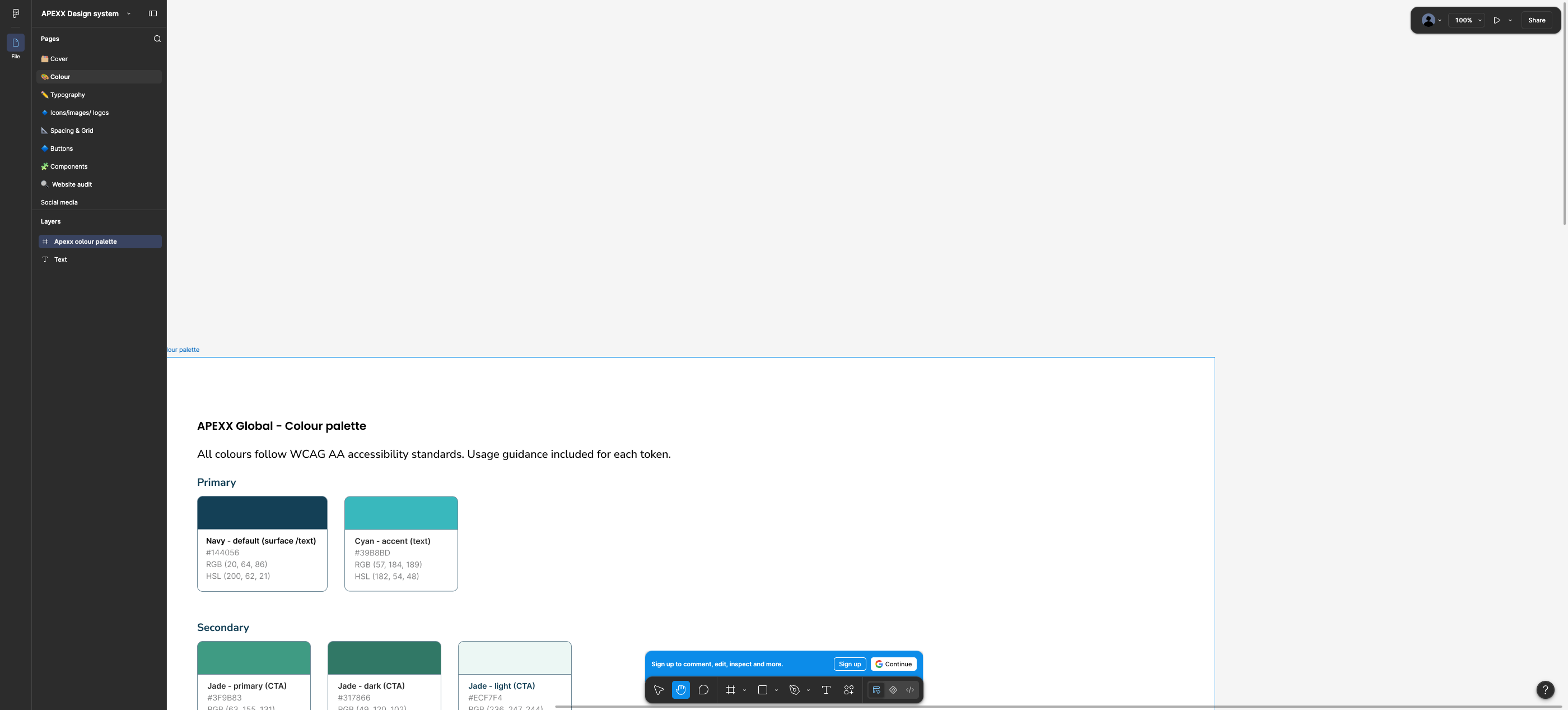
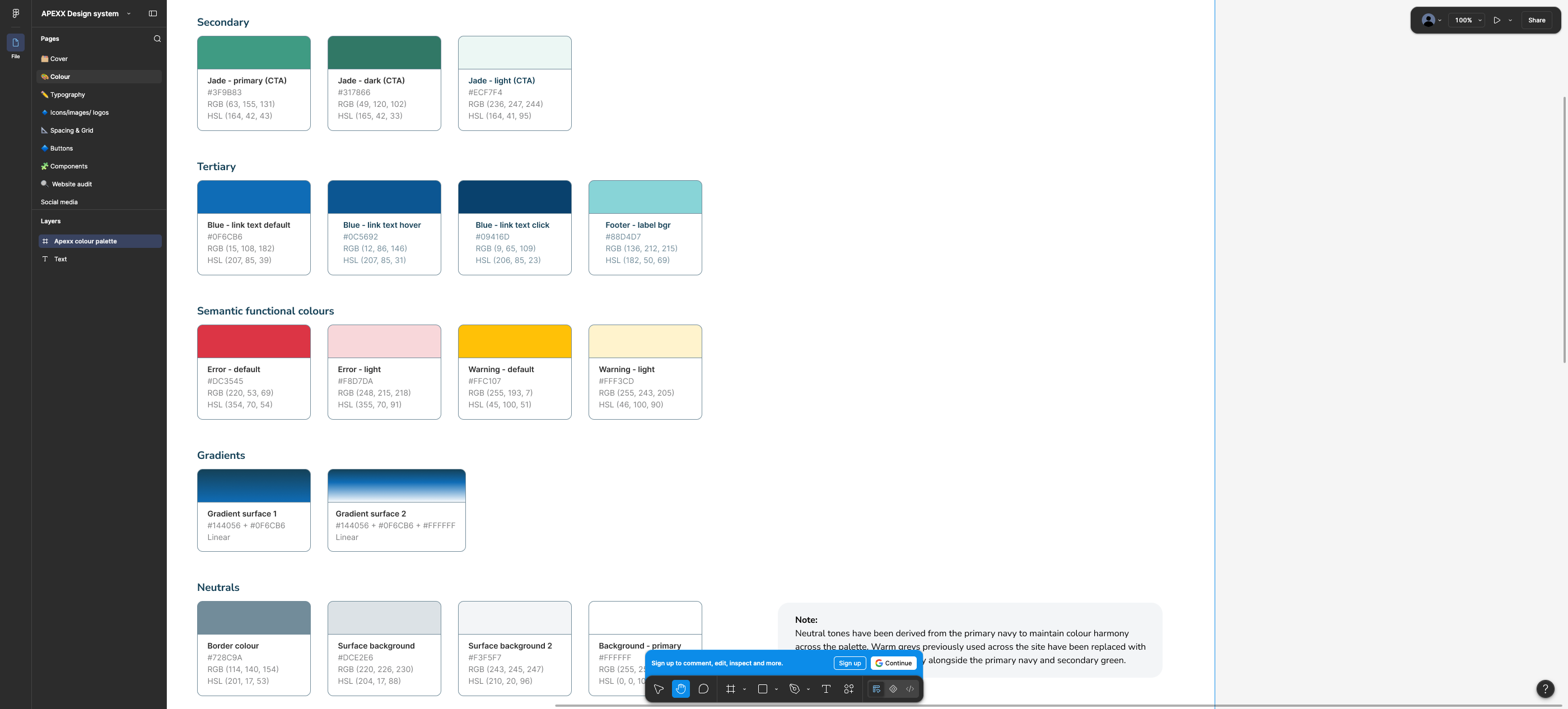
#144056
#39B8BD
#3F9B83
#317866
#ECF7F4
#0F6CB6
#0C5692
#09416D
#88D4D7
#DC3545
#F8D7DA
#FFC107
#FFF3CD
#728C9A
#DCE2E6
#F3F5F7
#FFFFFF
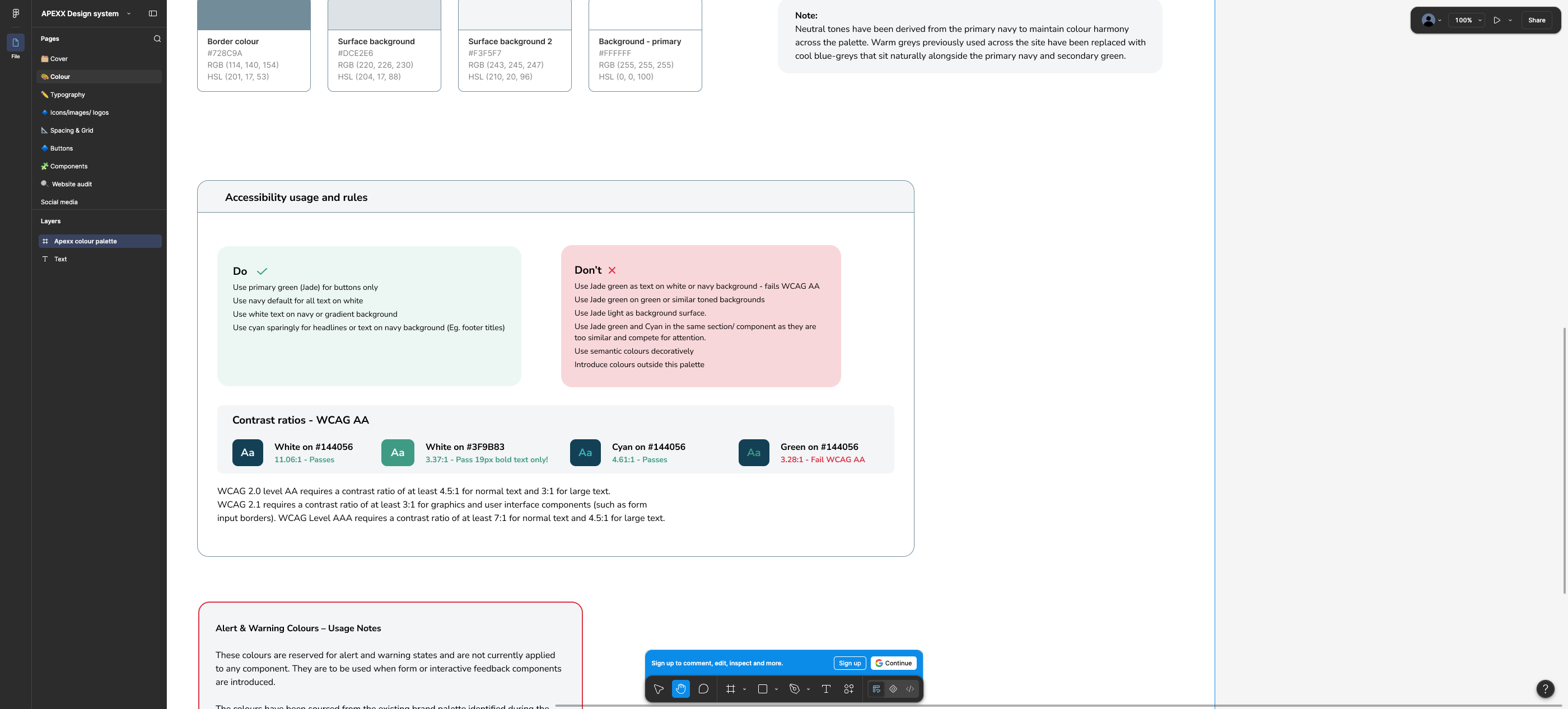
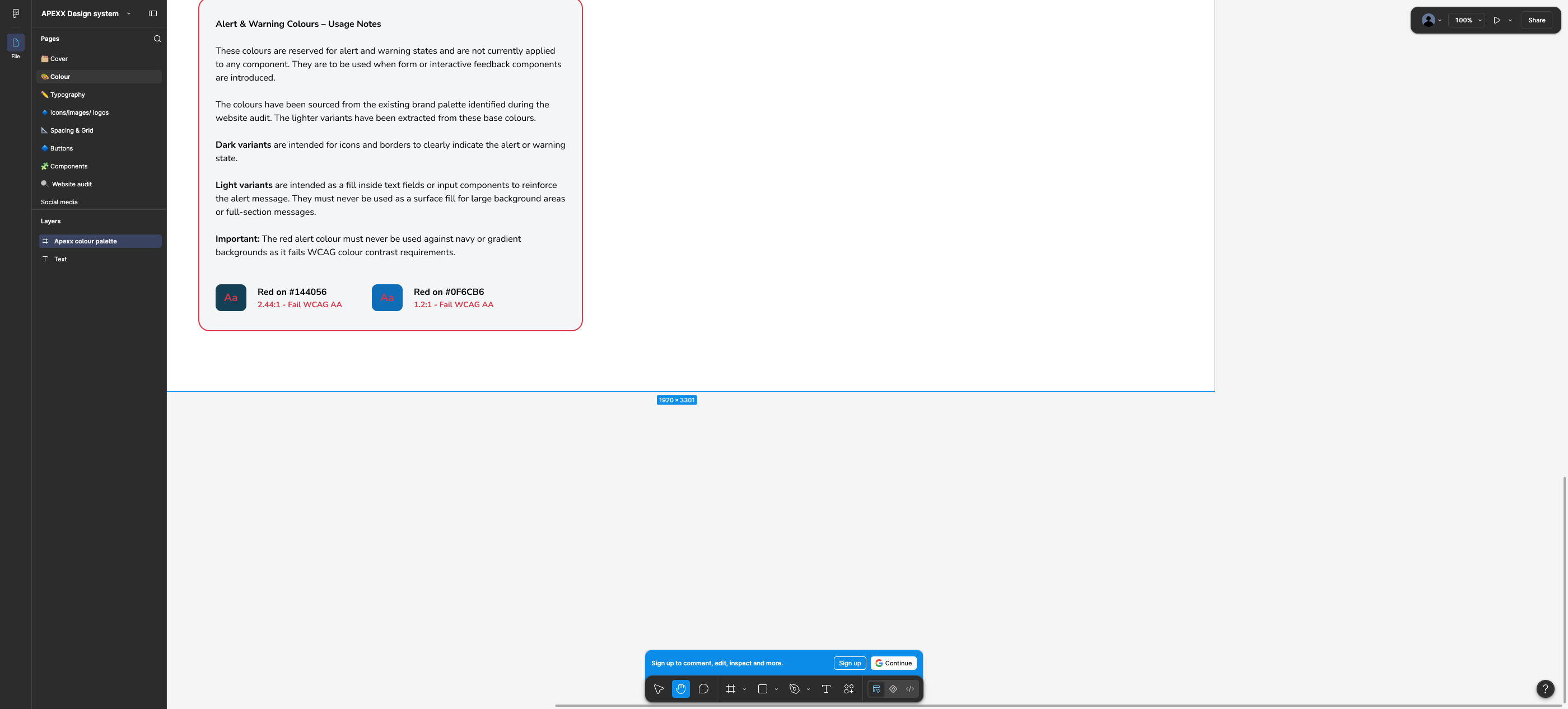
Stated rules: primary green (jade) for buttons only; navy for all text on white; white text on navy or gradient; cyan sparingly for headlines/text on navy. “Don't” list includes: jade as text on white or navy (fails AA), jade on green-toned backgrounds, jade light as a background surface, jade and cyan in the same section, semantic colours used decoratively, any colour outside the palette. Neutrals were re-derived from navy (cool blue-greys replacing the site's warm greys).
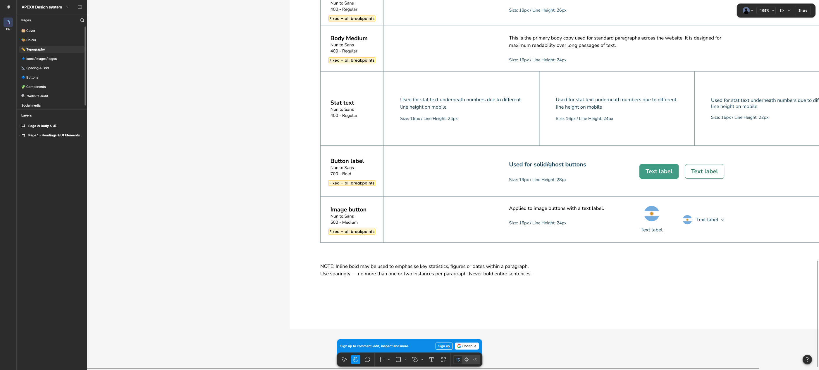
4.2 Typography
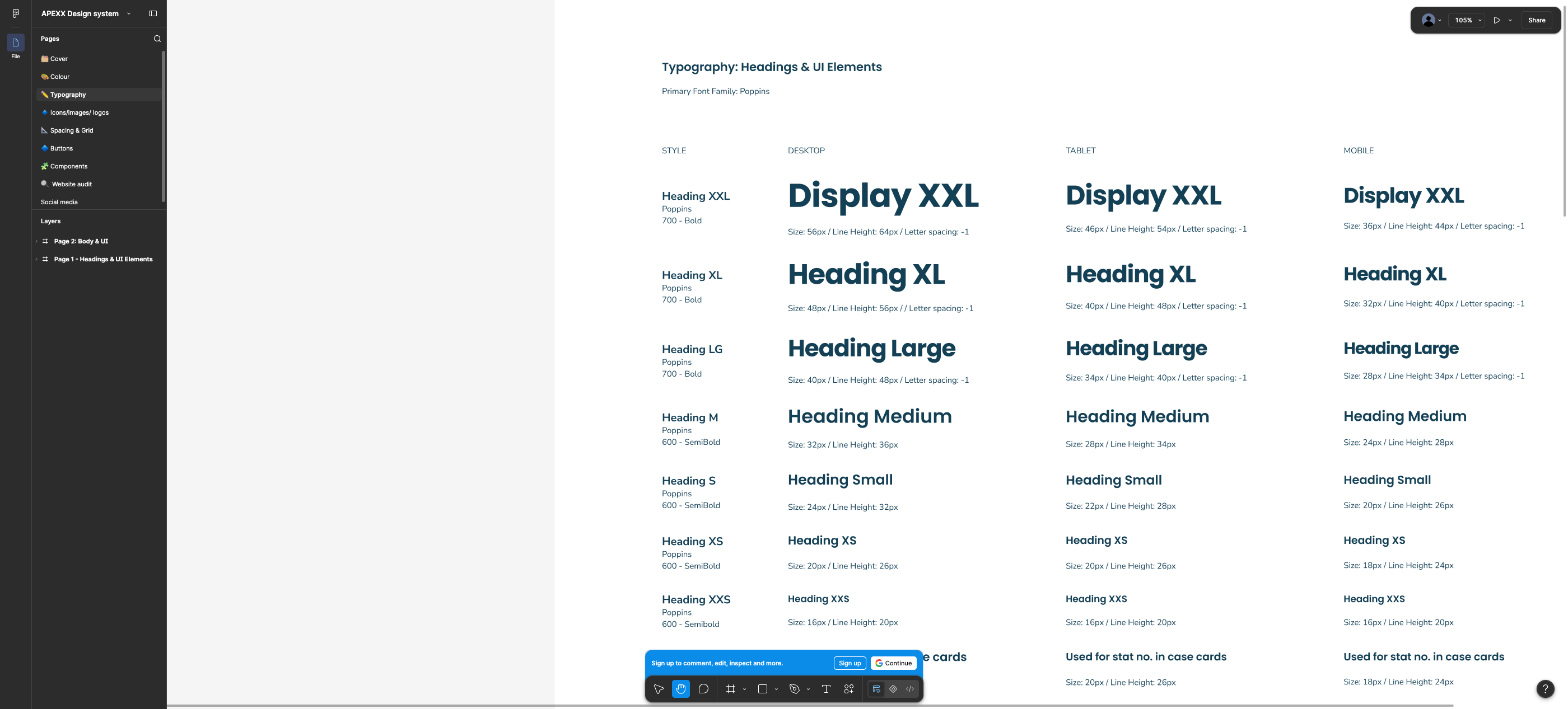
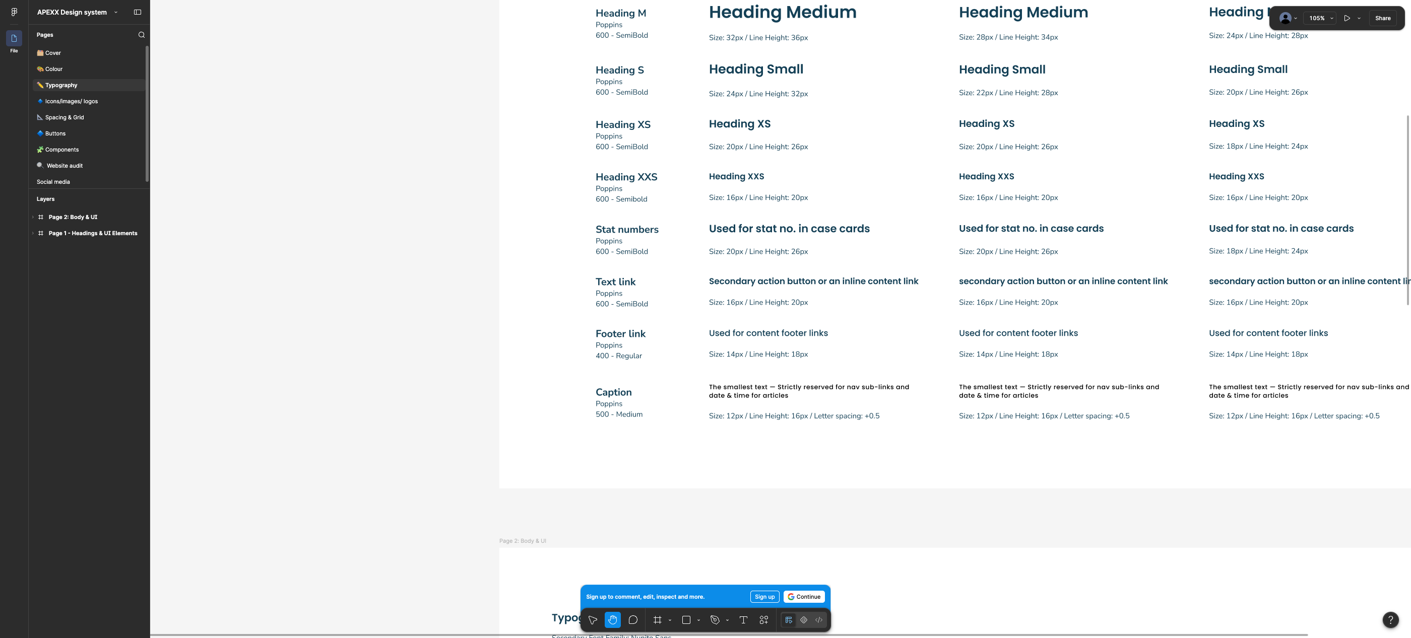
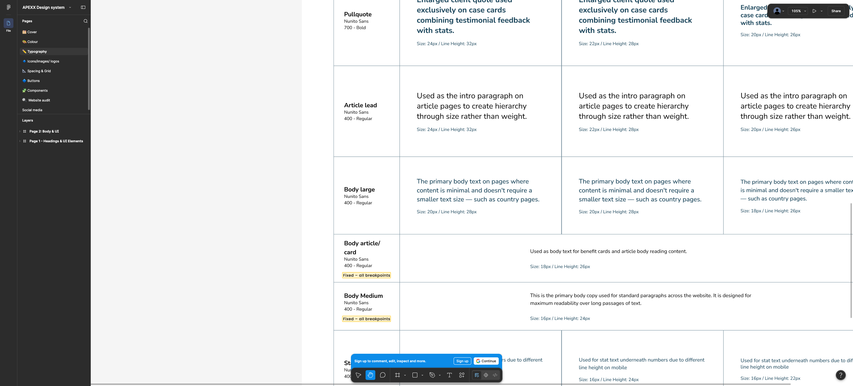
| Style | Family / weight | Desktop | Tablet | Mobile |
|---|---|---|---|---|
| Heading XXL (Display) | Poppins 700 | 56 / 64 / −1 | 46 / 54 | 36 / 44 |
| Heading XL | Poppins 700 | 48 / 56 / −1 | 40 / 48 | 32 / 40 |
| Heading LG | Poppins 700 | 40 / 48 / −1 | 34 / 40 | 28 / 34 |
| Heading M | Poppins 600 | 32 / 36 | 28 / 34 | 24 / 28 |
| Heading S | Poppins 600 | 24 / 32 | 22 / 28 | 20 / 26 |
| Heading XS | Poppins 600 | 20 / 26 | 20 / 26 | 18 / 24 |
| Heading XXS | Poppins 600 | 16 / 20 | 16 / 20 | 16 / 20 |
| Stat numbers | Poppins 600 | 20 / 26 | 20 / 26 | 18 / 24 |
| Text link | Poppins 600 | 16 / 20 | 16 / 20 | 16 / 20 |
| Footer link | Poppins 400 | 14 / 18 | 14 / 18 | 14 / 18 |
| Caption | Poppins 500 | 12 / 16 / +0.5 | 12 / 16 | 12 / 16 |
| Pullquote | Nunito Sans 700 | 24 / 32 | 22 / 28 | 20 / 26 |
| Article lead | Nunito Sans 400 | 24 / 32 | 22 / 28 | 20 / 26 |
| Body large | Nunito Sans 400 | 20 / 28 | 20 / 28 | 18 / 26 |
| Body article/card | Nunito Sans 400 | 18 / 26 — fixed all breakpoints | — | — |
| Body medium (primary body) | Nunito Sans 400 | 16 / 24 — fixed | — | — |
| Stat text | Nunito Sans 400 | 16 / 24 | 16 / 24 | 16 / 22 |
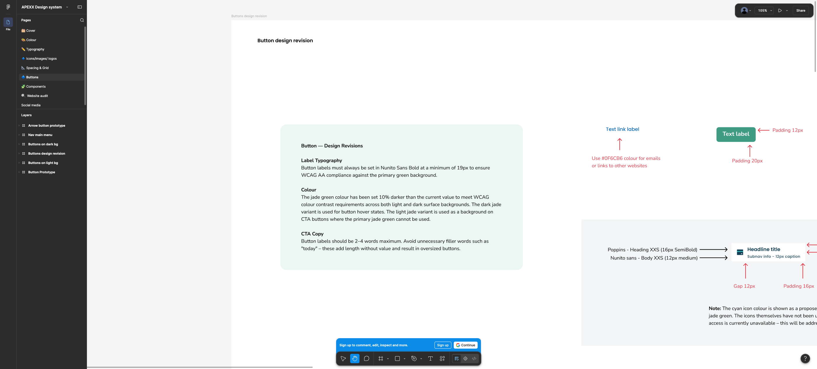
| Button label | Nunito Sans 700 | 19 / 28 — fixed | — | — |
| Image button | Nunito Sans 500 | 16 / 24 — fixed | — | — |
4.3 Spacing & grid
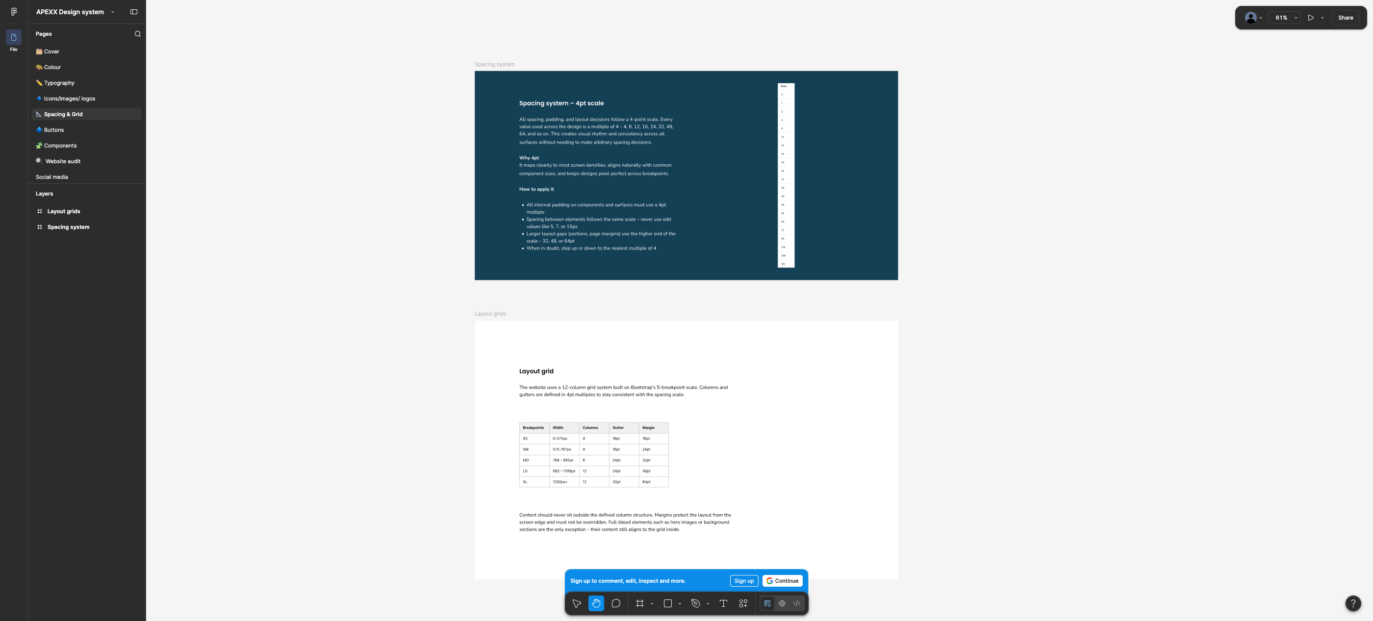
4pt scale (“never use odd values like 5, 7 or 15px”; section/page gaps use 32/48/64). Layout grid documented as 12-column, Bootstrap 5-breakpoint:
| Breakpoint | Width | Columns | Gutter | Margin |
|---|---|---|---|---|
| XS | 0–575px | 4 | 16 | 16 |
| SM | 575–767px | 4 | 16 | 24 |
| MD | 768–991px | 8 | 24 | 32 |
| LG | 992–1199px | 12 | 24 | 48 |
| XL | 1200px+ | 12 | 32 | 64 |
4.4 Components documented
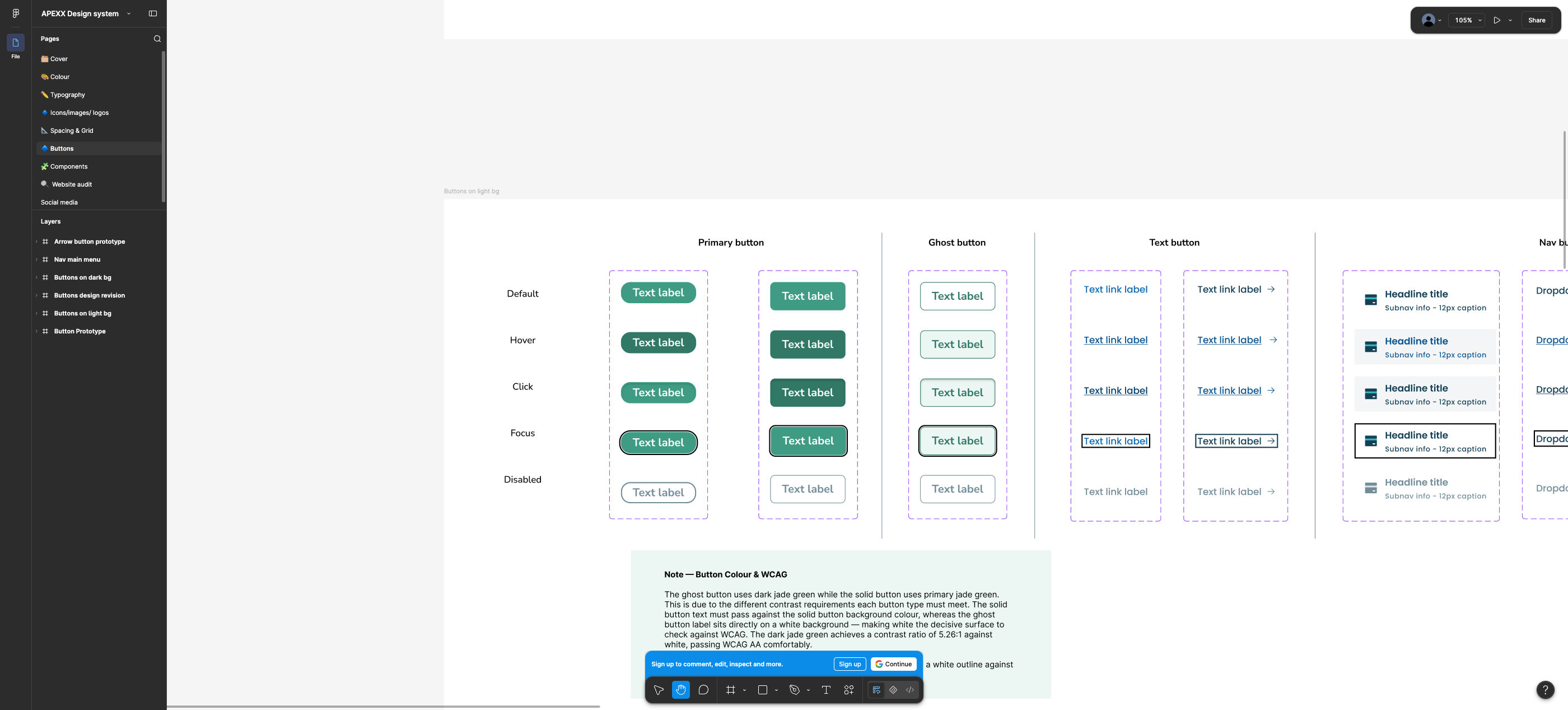
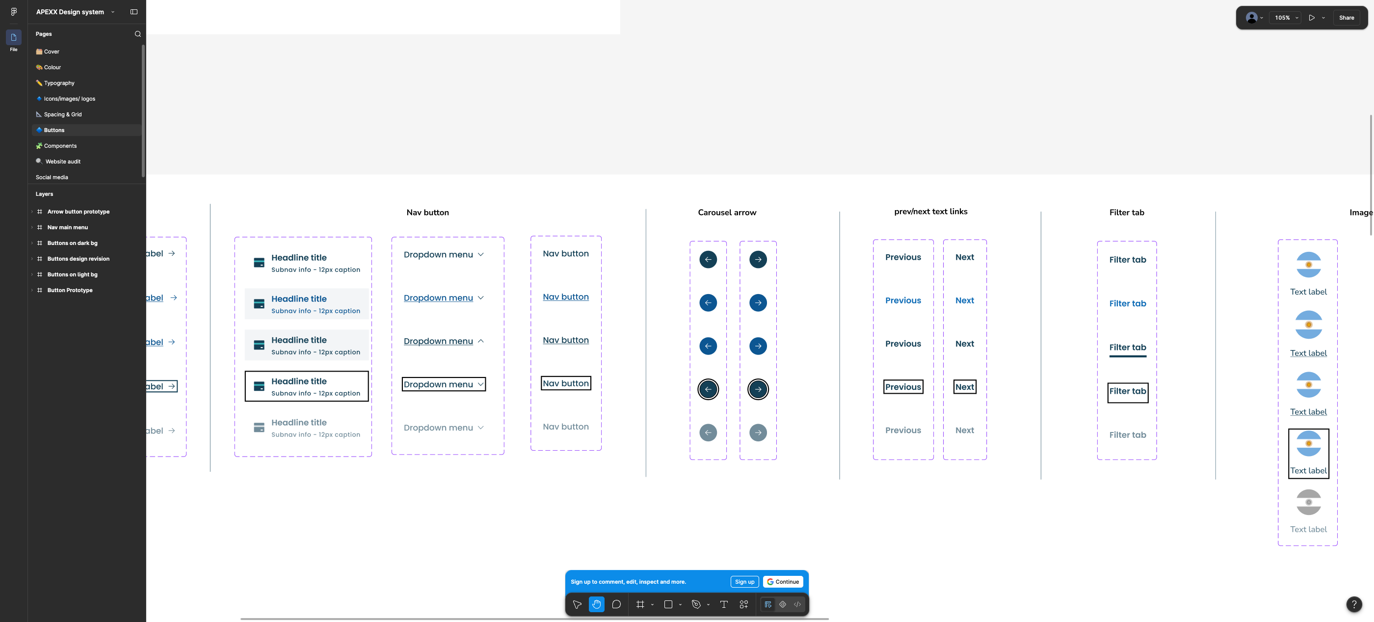
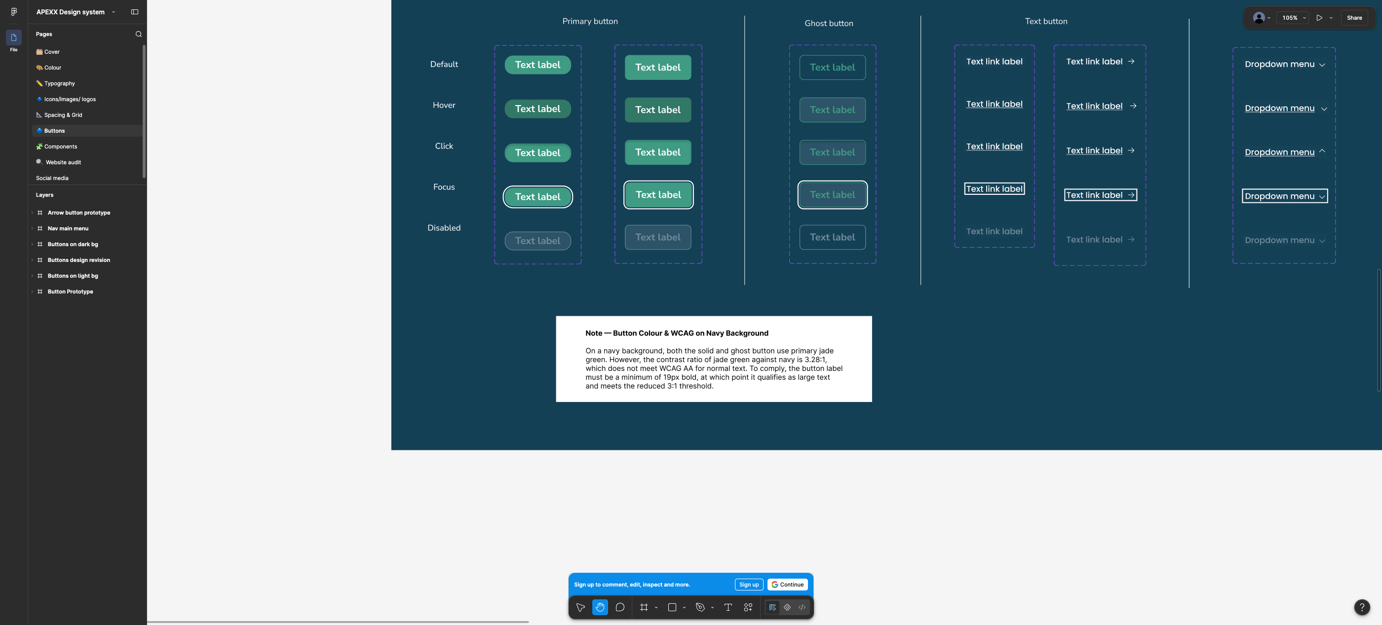
- Buttons — primary (2 corner radii), ghost, text button (with/without arrow), nav button, dropdown menu, carousel arrow, prev/next text links, filter tab, image button. States: default, hover, click, focus, disabled — shown on white and on navy.
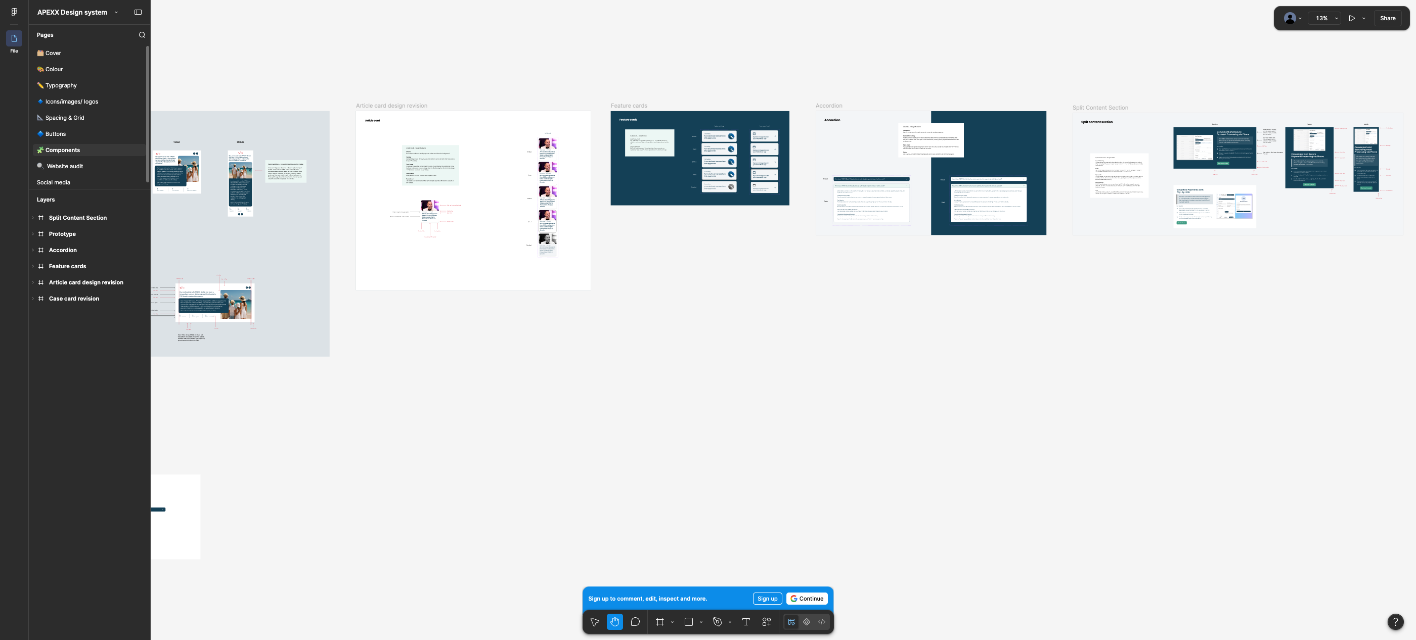
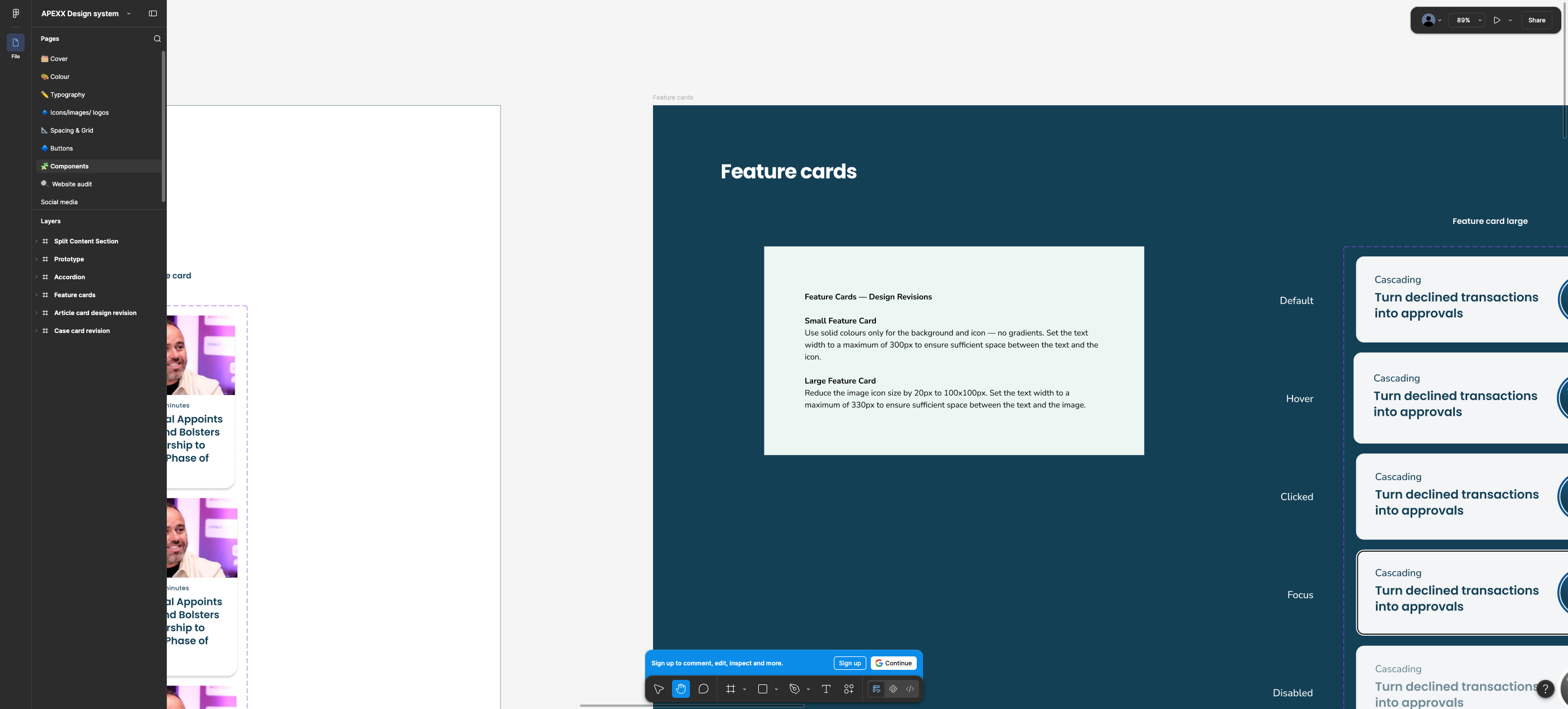
- Cards — feature card large, feature card small, article card, case card. All shown white-on-navy with states.
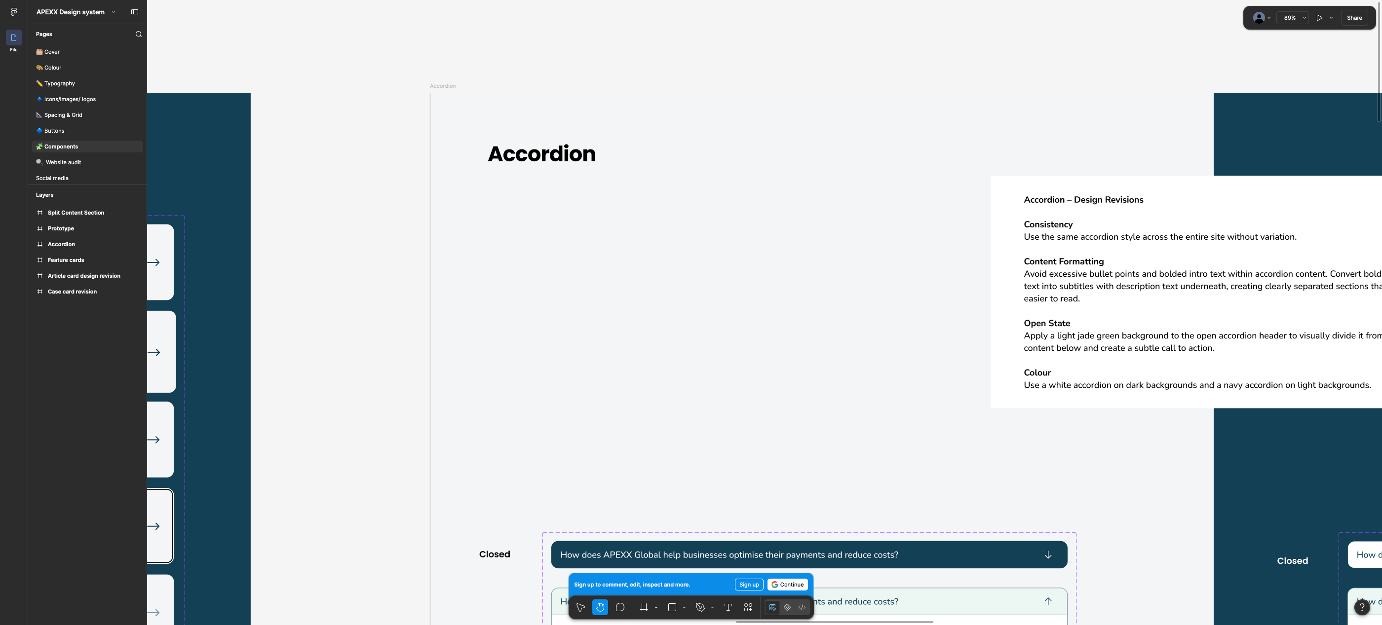
- Accordion — light and dark variants, open state uses jade-light header.
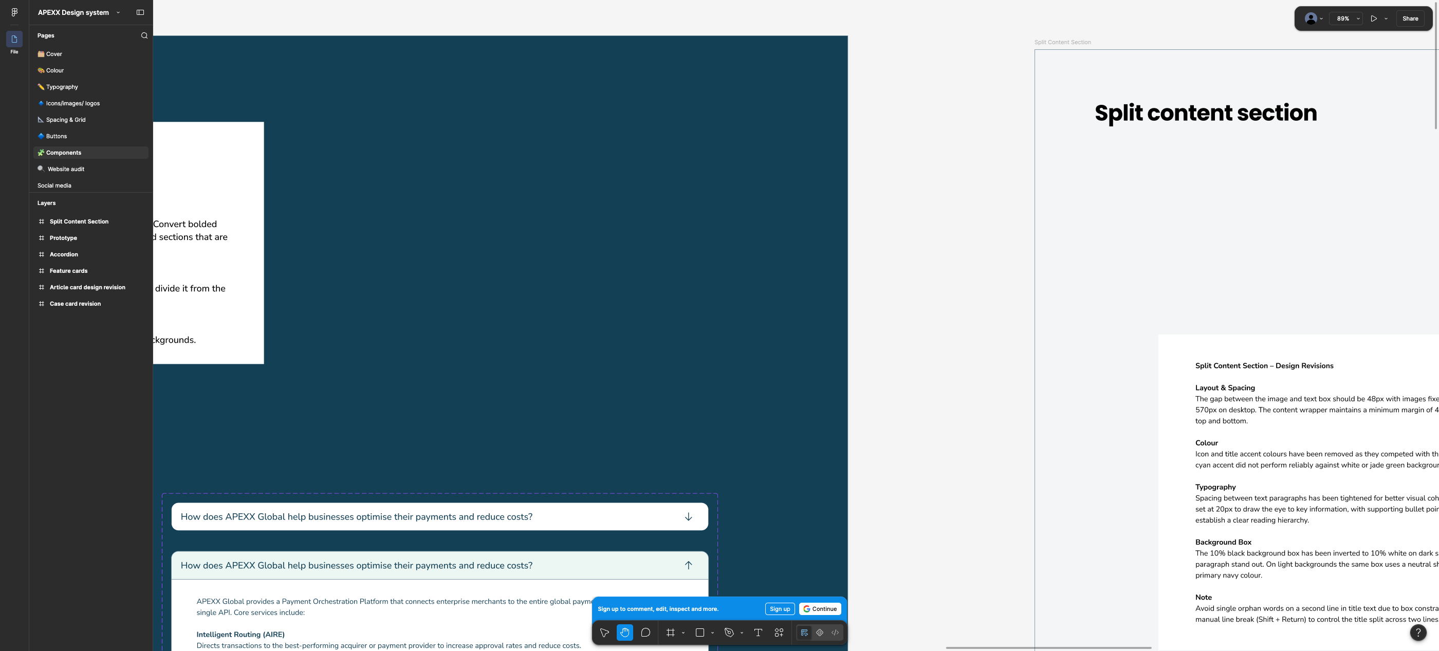
- Split content section — 48px gap, 570px fixed image, tightened paragraph spacing, accent colours removed, 10% black tint box (inverted to 10% white on dark).
- Nav main menu — dropdown structure with headline + 12px caption rows.
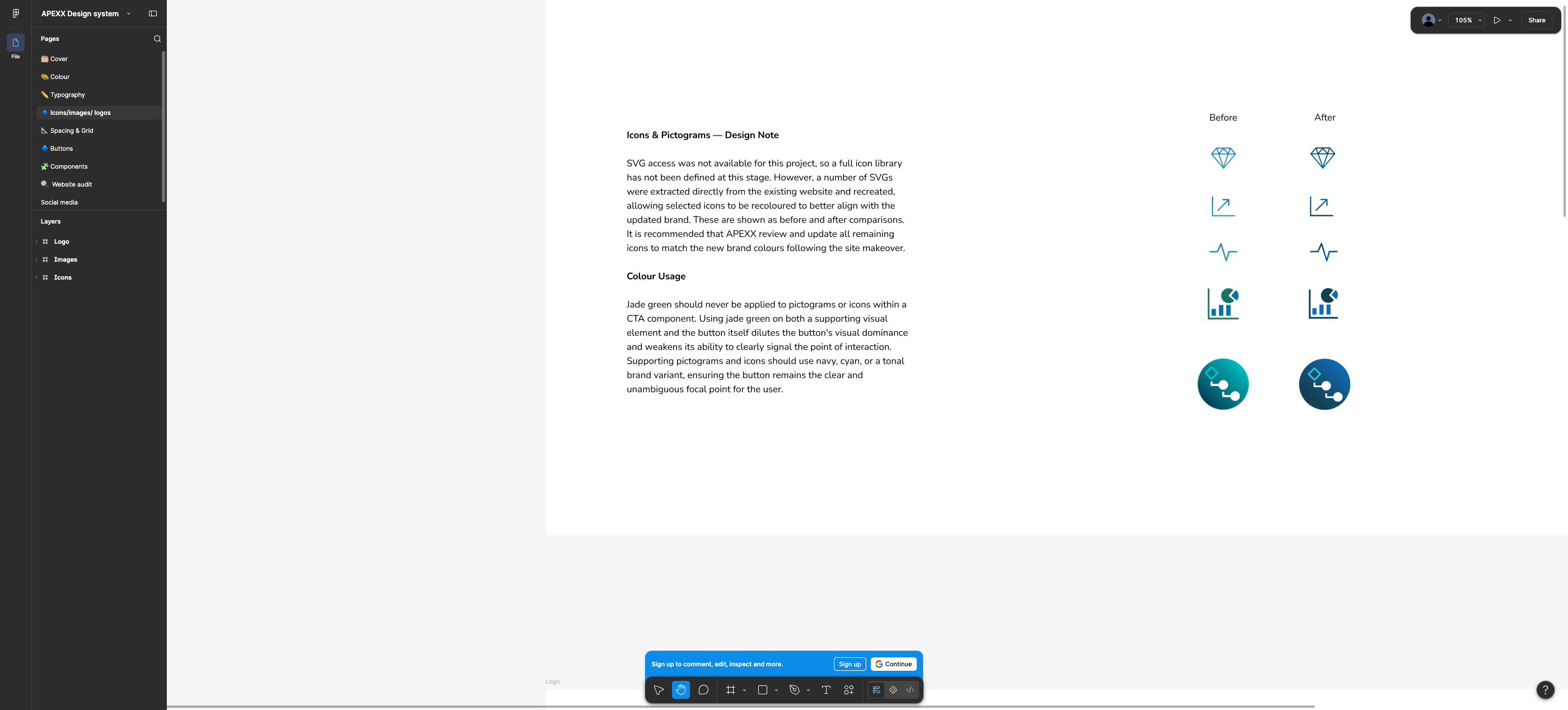
- Icons / logos / images — logo clear-space and min sizes, image crop/focal-point do & don't, recolour before/after for a handful of extracted SVGs.
The Icons page states plainly: “SVG access was not available for this project, so a full icon library has not been defined at this stage… It is recommended that APEXX review and update all remaining icons.” The icon layer is therefore explicitly unfinished.
5. Match / partial / divergence
Foundation-by-foundation. “Partial” means the concept survives but values or coverage change.
| Area | Status | Current build | Proposed | Implication |
|---|---|---|---|---|
| Primary navy | Match | #144056 as --color--primary | #144056 navy default |
No change. Brand anchor is stable. |
| Link blues | Match | blue700 #0F6CB6 already in ramp | Link default/hover/click #0F6CB6 / #0C5692 / #09416D |
Adds the two missing interaction states; same base hue. |
| Type scale steps | Match | 48 / 40 / 32 / 20 / 18 heading steps | 48 / 40 / 32 / 24 / 20 / 16 + 56 display | Mostly the same rhythm; h1 drops 64 → 56, an XXS 16 step is added, and h5/h6 line-heights tighten. |
| Spacing rhythm | Match | Row padding 96 / 64 / 48px (6/4/3rem) | 4pt scale, big gaps 32/48/64 | Existing paddings are already 4pt multiples — cheap alignment. |
| Accordion pattern | Partial | Navy summary on light, white summary on dark; grey body | Same inversion rule; open header becomes jade-light | Small token change (--color--accordion--summary--*, new open-state background). |
| Split content / alt row | Partial | AltRow, image/text alternating, gradient allowed | 48px gap, 570px image, no accents, tint box | Layout spec exists but only for 2 of the current row's configurations. |
| Button colour | Diverges | Primary #144056; large/small variants use teal #46AC92 / #6ECDD6 |
Single jade #3F9B83 primary + jade-dark ghost, min 19px bold label |
Live teal buttons with white labels measure 2.77:1 and 1.85:1 — the new spec is a fix, not a preference. But .large/.small rich-text button classes have no counterpart. |
| Heading colour | Diverges | --color--headings defaults to teal #46AC92 on white (2.77:1) |
Navy for all text on white; jade never as text | Fixes a real AA failure sitewide; also removes the *asterisk* → .alt teal-highlight convention used in titles. |
| Heading font | Diverges | Ambit (self-hosted, 6 weights + italics, CoType EULA) | Poppins 600/700 | Full heading-family swap; Ambit files/licence become redundant. Confirm this is intentional brand direction. |
| Body font | Diverges | Poppins 400 @16/1.5 | Nunito Sans 400 @16/24 | Body-family swap with knock-on effects on line lengths and vertical rhythm across every row. |
| Neutrals | Diverges | Warm greys #f7f7f7 … #262626 | Cool blue-greys #F3F5F7 / #DCE2E6 / #728C9A |
Grey row background, table cells, borders, blockquote tints all shift; #728C9A on white is 3.54:1 so it is a border/UI colour only, never text. |
| Gradients | Diverges | 5 gradients (dark, mid, light, neutral, extra-light) | 2 gradient surfaces, both navy→blue | Three light/teal gradients disappear with no replacement mapping. Accordion rows in production all sit on bg-gradient-light. |
| Semantic colours | New | None (no form feedback tokens) | Error/warning + light variants, with usage notes | Purely additive; needed if forms move in-house (contact-us currently HubSpot-embedded). |
| Interaction states | New | :hover + :focus-visible only; no disabled/pressed |
5 states on every button/card/tab/link | Additive and valuable; requires new CSS in every row component. |
| Breakpoints | Diverges | Custom max-width: 992px / 767px; Bootstrap 4 in deps | Bootstrap 5 five-tier (576/768/992/1200) | 767 vs 768 boundary conflict, and no rules today for ≥1200 or ≤575. Container is 1170px (BS4) vs XL margin 64px implied by the grid. |
| Motion | Missing | Scroll fade-ins on every row (data-animation-*) | Not documented | No guidance on whether to keep, restyle, or drop the animation layer. |
6. The background × foreground matrix problem
This is the question that decides whether the new system is implementable. Answer: as documented, no — it covers 2 surfaces where the CMS exposes 8.
Every flexipage row re-points a token set. Below is what a background variant actually has to define in code today
(from FlexipageStyles.js), and whether the proposed system gives an answer for it.
| Foreground token group | Tokens involved | Documented for white / light? | Documented for navy? | Documented for the 5 gradients + grey? |
|---|---|---|---|---|
| Body text | --color--paragraph | Yes navy | Yes white | Gradient: “white text” rule only; grey surface unstated |
| Headings + alt headings | --color--headings, --color--headings--alt | Yes navy | Yes white / cyan sparingly | No |
| Inline links | --color--link | Yes #0F6CB6 + hover/click | No — #0F6CB6 on navy is 2.02:1 | No |
| Primary button | --color--button--background/-text/-hover/-focus | Yes | Yes | No — jade on light-teal gradients is explicitly a “don't” |
| Large / small button variants | --color--button--large--*, --color--button--small--* | No | No | No |
| List markers | --color--list-item--marker | Implied navy | Implied | No |
| Blockquote | background, border, text (3) | No | No | No |
| Tables | --color--th--background/-text, --color--td--background/-text, --color--tr--border | No | No | No |
| Accordion | summary bg/text, body bg/text/link, toggle (6) | Yes | Yes | No — yet every live accordion sits on gradient-light |
| Two-column subtitle ring/line | --color--subtitle--circle, --color--subtitle--line | No | No | No |
| Hero CTA panel | --color--hero-cta--panel--background/-text | Feature-card treatment implies it | Partial | No |
| Tabbed interface | --color--tabbed--container--background/-text | Filter tab covers light only | No | No |
6.1 Why gradients are the hard case
A gradient has no single contrast value. bg-gradient-dark runs #144056 → #428AC9; the current build puts
teal #55BAA3 headings and white body text on it:
- teal
#55BAA3on the navy end: 4.71:1 — passes AA for normal text. - the same teal on the blue end
#428AC9: 1.57:1 — fails everything. - white body text on that blue end: 3.68:1 — fails AA for normal text (passes only as large text).
So a row's compliance depends on how tall the row is and where the text lands in the ramp. The proposed system keeps two
gradient surfaces and says “use white text on navy or gradient background”, which is still not sufficient: gradient surface 2 ends in
#FFFFFF, where white text is invisible. No stop-position or minimum-contrast constraint is specified.
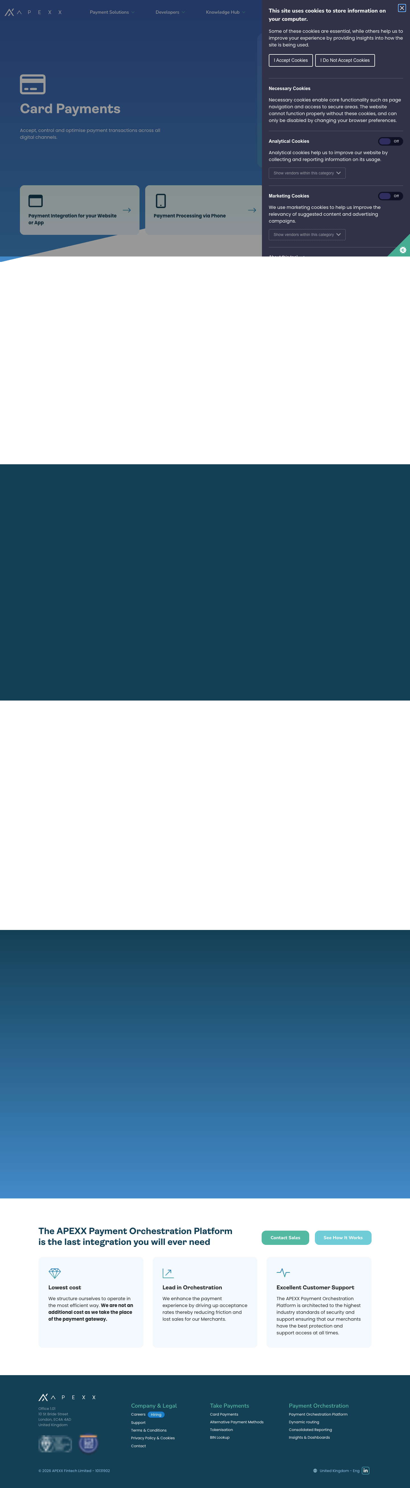
Recommendation. Either (a) restrict gradients to hero/full-bleed decoration and forbid body content over them, or (b) define each gradient with a guaranteed-contrast band (e.g. content only over the first 60% of the ramp) plus per-gradient token sets. Option (a) is what the redesigned Card Payments and APM pages actually do — the gradient is confined to the hero, and content rows are white/navy/grey. That intent should be written down as a rule, because right now the CMS still allows gradient content rows.
7. Flexipage row coverage — what was designed, what was missed
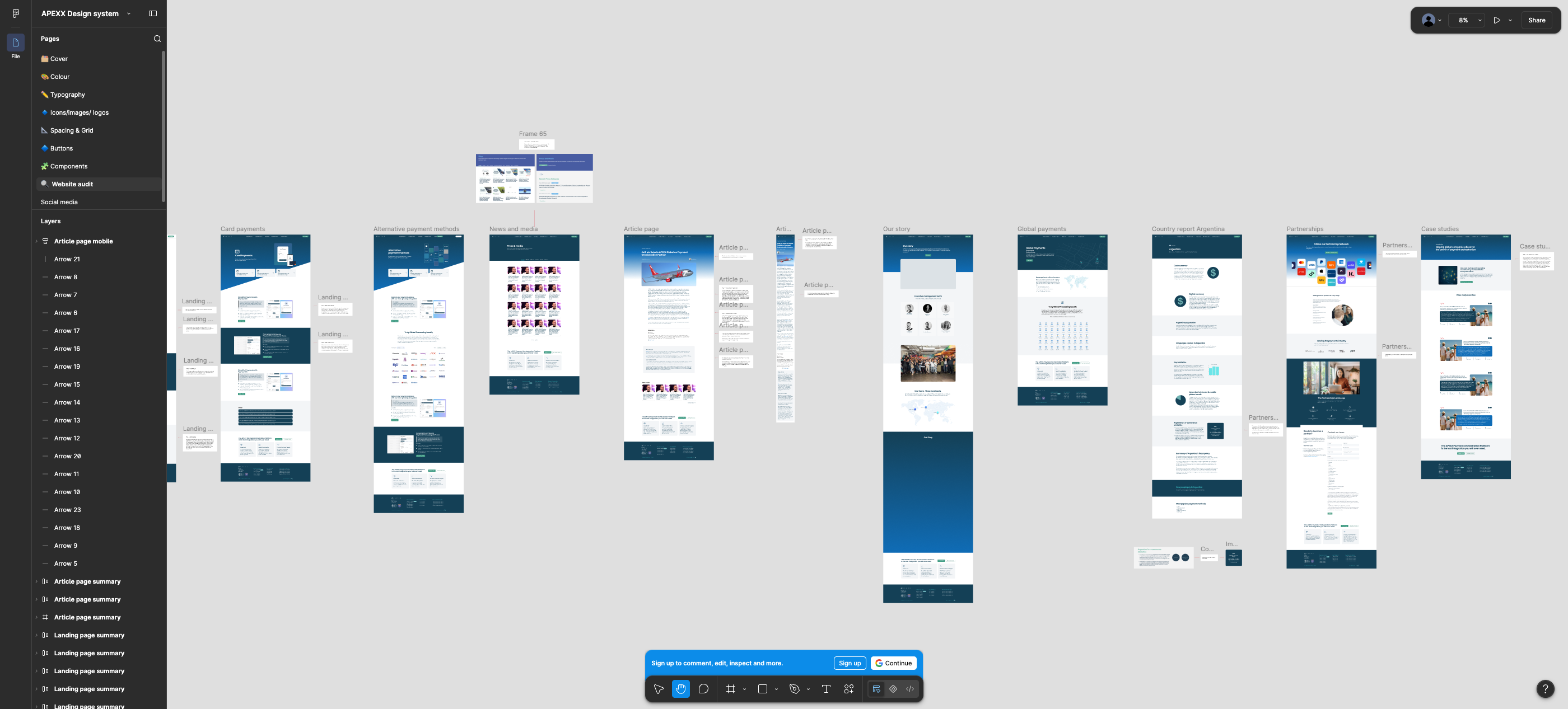
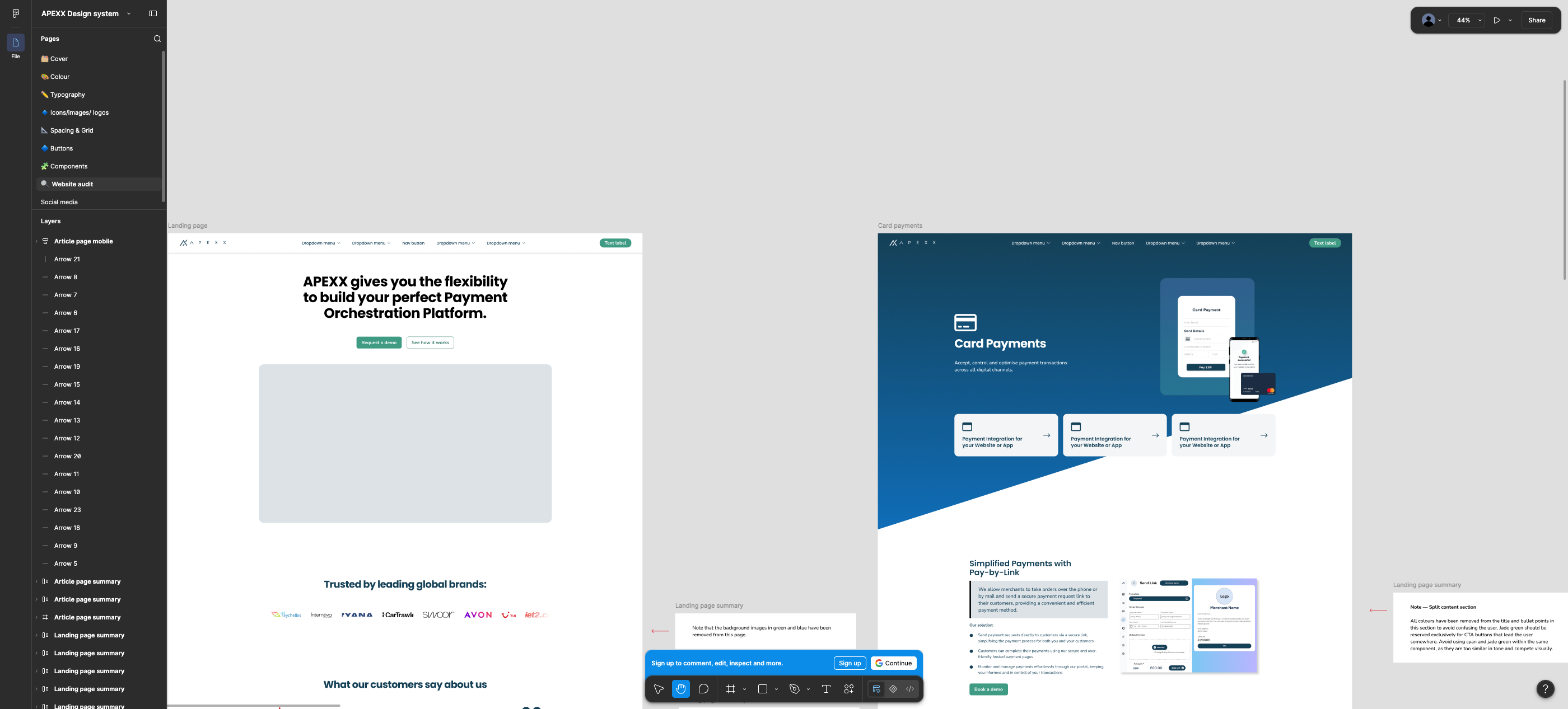
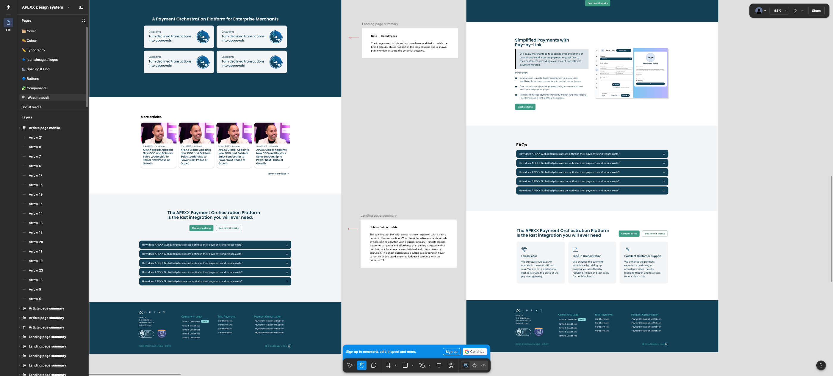
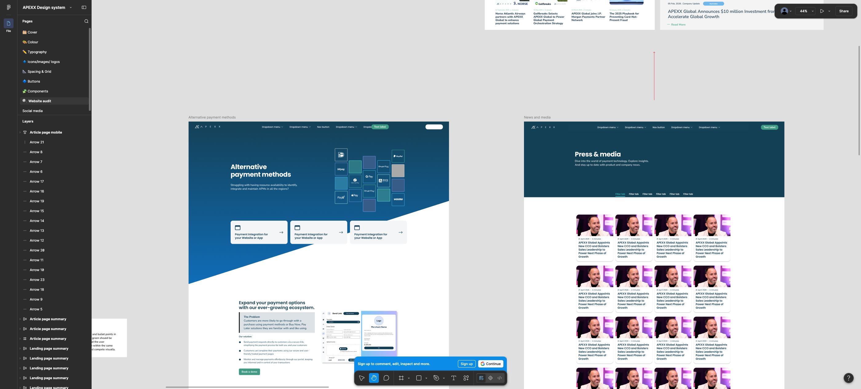
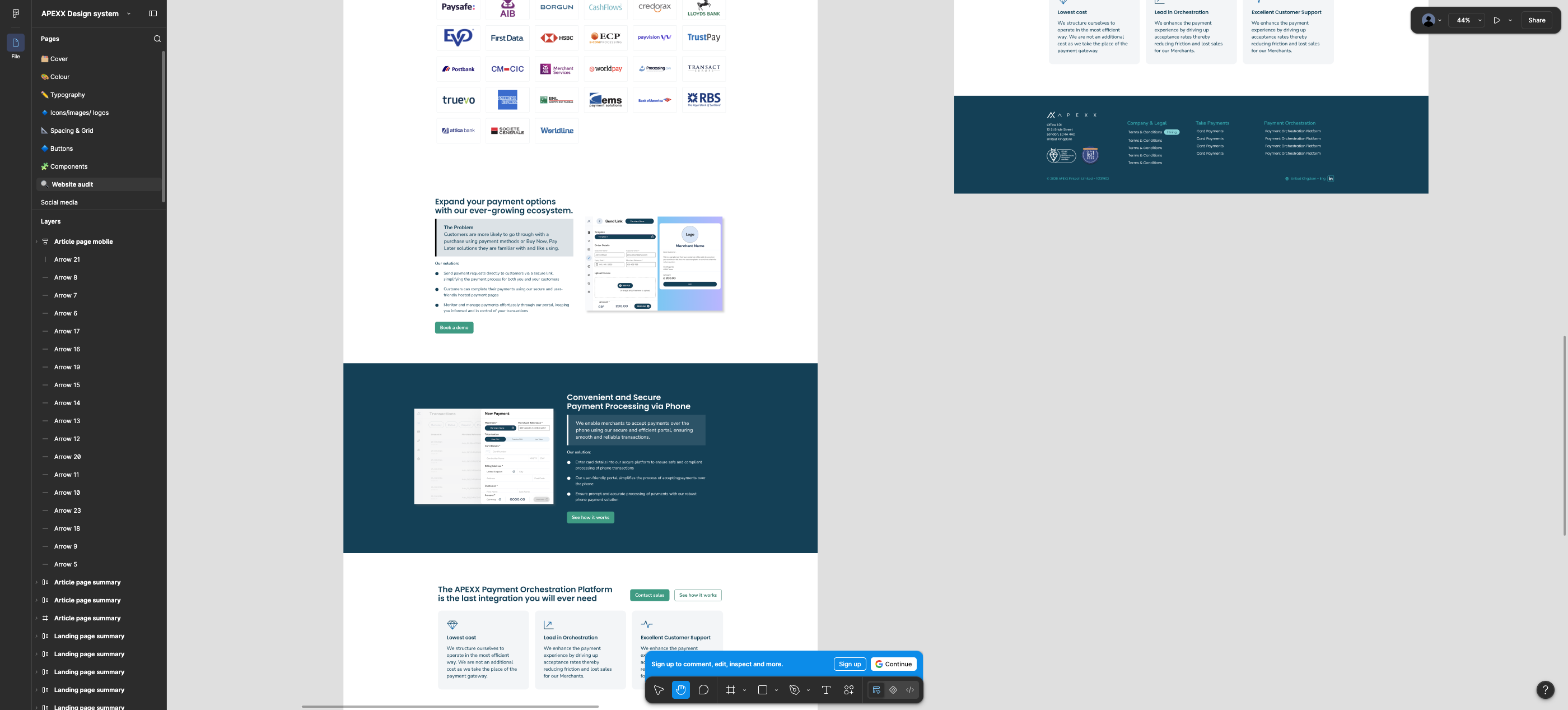
The Website-audit page shows full redesigns for two flexipage-driven URLs (Card Payments, Alternative Payment Methods). Mapping those designs back onto the row inventory shows what is unaddressed.
7.1 Row-by-row
| Row type (CMS set) | Live usage (12 flexipages) | New design provided? | What is missing |
|---|---|---|---|
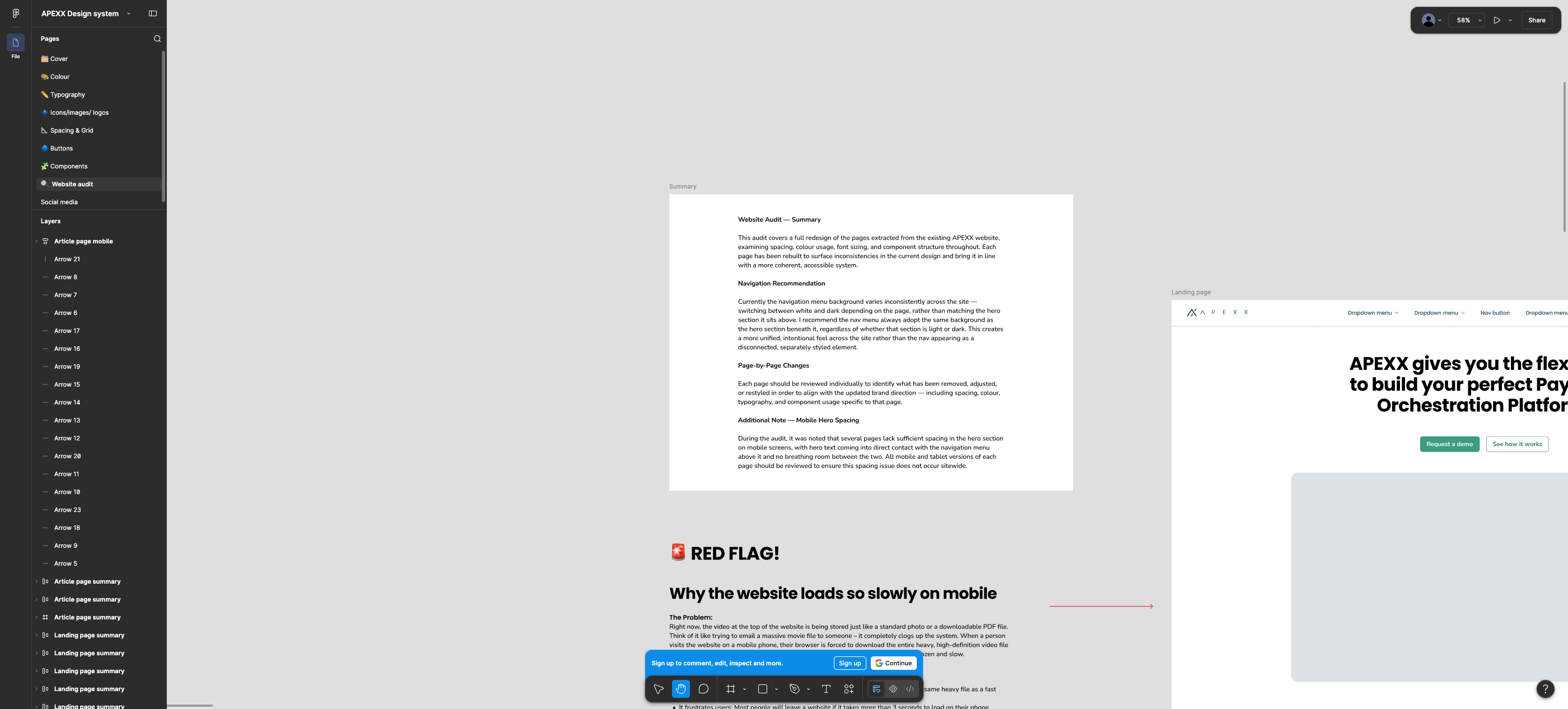
| HeroSection (+ hero panels, video, icon) | 12 / 12 | Partial | Desktop hero redesigned on both pages (diagonal navy→blue, cards overlapping the fold). No spec for: hero video variant, hero icon, hero panel link row as a component, or the tablet/mobile hero — even though the audit summary itself flags mobile hero spacing as a sitewide defect. |
| AltRow (image/text, alternating, video items) | 39 instances — the workhorse | Yes | Covered by “Split content section” + page examples. But only image-left and text-left on white and navy; the multi-item alternating stack, video-in-column items, and gradient variants aren't shown. |
| CopyRow (bard rich text, centre/left, inline CTA, video) | 4 instances | Partial | Body/heading styles exist, but no design for the row itself: centred text measure, inline CTA button placement, embedded video block, and no styling shown for tables, blockquotes, or ordered lists that this row can contain. |
| AccordionRow | 5 pages (all on bg-gradient-light) |
Yes | Component designed for light and dark surfaces; the gradient-light surface it currently uses isn't in the new palette, so a mapping decision is needed. Intro-copy area above the accordion isn't shown. |
| PanelsRow (2/3-col, 3 row styles: grid, gradient panels, white panels) | 0 in production (styled and available) | Partial | Feature card large/small replace the panel visually, but only as white cards on navy. The three row_style options, the 3-column layout, the uppercase Ambit panel title, and the highlighter-pen title treatment have no equivalent — so the CMS options would have to change with it. |
| TestimonialsRow (slick carousel, avatar, name, position) | 0 in production | No | Nothing. Pullquote type style exists, and case cards exist, but no testimonial panel, no carousel dots/arrow spec for this row, no avatar sizing. |
| CallToActionRow (label, tagline, button; hard-coded gradient-neutral) | 0 in production | No | The redesigned pages end with a bespoke closing CTA (heading + two buttons + three benefit cards) which is not this row. Its hard-coded bg-gradient-neutral is also a gradient that the new palette deletes. |
| TwoColumnsRow (subtitle ring/line, 2 rich-text columns, centre option) | 0 in production | No | Nothing — including the distinctive SubTitle circle+line ornament, which has dedicated tokens per background. |
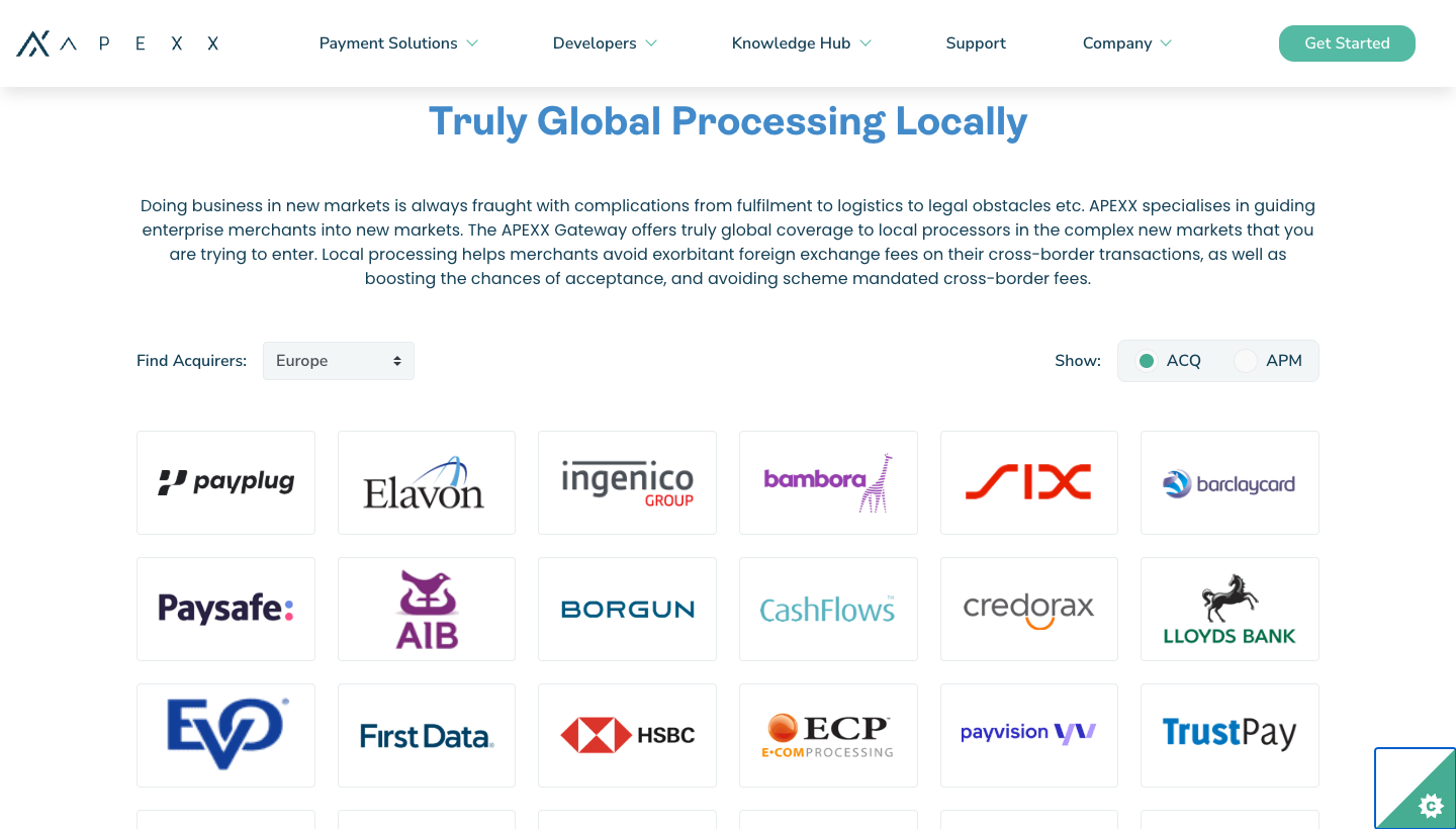
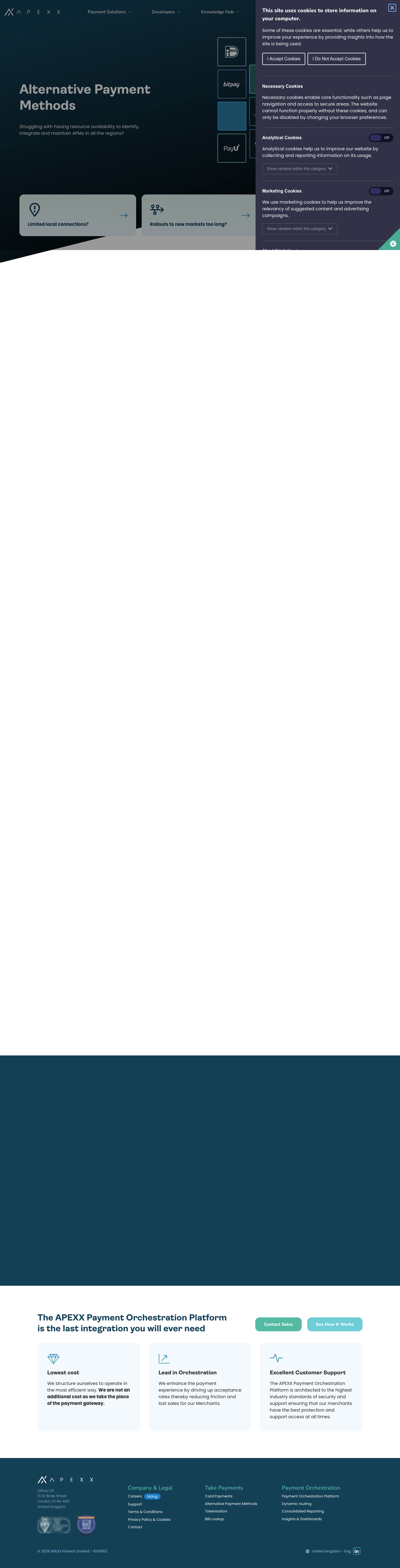
| WidgetRow — Logos Map | Used on APM (+ most pages via footer variants) | No | The interactive world-map-with-logos widget is not redesigned. The APM redesign replaces it with a static acquirer logo grid — if that is the intent, say so, because it is a functional removal, not a restyle. |
| WidgetRow — Payment Orchestration Platform diagram | Used on payment-orchestration-platform | No | No design. This is the most complex interactive component on the site. |
| WidgetRow — BNPL Logos Slider | 0 in production (available) | No | No design; carousel arrows exist as buttons but no slider-row layout. |
Rich-text sub-elements: tables (+responsive card mode), blockquote, ol/ul markers, inline video, .large/.small buttons, .alt heading spans |
Tables/blockquotes styled; buttons used (36 .large instances) |
No | None of these appear anywhere in the new system, yet they are all editor-reachable through Bard fields. Tables in particular carry six tokens per background. |
Score. 4 of 11 row/widget variants have a usable new design; 2 are partial; 5 have none. Counting the rich-text sub-elements as one bucket, roughly 60% of what an editor can build today has no designed counterpart — but four of the undesigned rows have never been used in production, so most of that gap can be closed by retirement rather than by design work. §12.2 turns this into a sign-off table with a per-row recommendation.
7.2 What the two designed pages actually contain
Both redesigned pages are built from the same small kit: hero (diagonal gradient) → 3 small feature cards → split content (light) → split content (navy, image left) → logo grid or FAQ accordion → closing CTA with 3 benefit cards → footer. That is a page pattern, and a good one — but it is narrower than the flexipage model, which is by design open-ended. Two possible readings, and they lead to very different builds:
- Reading A — constrain the CMS. Retire the unused rows (Panels, Testimonials, CTA, TwoColumns, BNPL slider) and the unused backgrounds (Grey, gradient mid/neutral/extra-light), then the designed kit is nearly sufficient. Cheapest path, and consistent with the fact that none of them carry production content. This is the route the decision tables in §12 take.
- Reading B — keep the CMS open. Then the design system must gain ~7 more component specs and a per-surface token matrix before it can be implemented without designers-by-proxy decisions being made in code.
8. Page/template coverage
The Figma audit page covers 10 page designs. The site has considerably more templates.
| Template / page | Implementation | Designed in audit? |
|---|---|---|
| Landing / home | src/pages/index.jsx + HomePage components | Yes (“Landing page”) |
| Card Payments | flexipage | Yes |
| Alternative Payment Methods | flexipage | Yes |
| Blog article | templates/blog-article.jsx | Yes (desktop + mobile) |
| Press & media / news listing | src/pages/press-and-media.jsx | Yes (“News and media”, with filter tabs) |
| Our story | src/pages/our-story.jsx | Yes |
| Partnerships | src/pages/partnerships.jsx | Yes |
| Case studies | src/pages/case-studies.jsx | Yes |
| Country report (focus) | templates/country-report-focus.jsx | Yes (“Country report Argentina”) |
| “Global payments” | No such live URL | Designed, unmapped — new page or a rename of an existing one? |
| Remaining 9 flexipages (revenue-protect, smart-split, cascading, dynamic-routing, insights-and-dashboards, payment-orchestration-platform, tokenisation, consolidated-reporting, bin-lookup) | flexipage | No — assumed to inherit the two designed patterns; the POP diagram page in particular cannot |
Careers (/careers-page-test/) — newest flexipage, still changing | flexipage | No — and it introduces four patterns that exist nowhere else: hero panel links, emoji-as-icons, long-form editorial columns, flat mint illustration. Detail in §12.3 |
| Blog listing + category listing + pagination | templates/blog-listing*.jsx | No (news listing is a different template) |
| Contact us (+ embedded form) | src/pages/contact-us.jsx | No — and semantic error/warning colours exist precisely for forms |
| Cost saving calculator / surcharge inspector | src/pages/cost-saving-calculator.jsx, surcharge-inspector.jsx, ApexxCalculator, apexcharts | No — no input, slider, chart or data-viz tokens anywhere in the system |
| Country reports index | src/pages/country-reports.jsx | No |
| Landing pages (campaign template) | templates/landing-page.jsx | No |
| Privacy / T&Cs / 404 | src/pages/* | No — long-form legal text has no documented layout |
| Global chrome: header/mega-nav, cookie banner, “How APEXX can help” footer CTA, footer | components/Global/Layout/* | Nav menu + footer appear inside page mocks; cookie banner and help-CTA section not specified |
The audit summary explicitly recommends the nav background always match the hero section beneath it — a global behaviour change
that touches Layout.jsx's headerTransparent / whiteToggler / logoDark props on every template, not just the designed pages.
9. Accessibility & contrast numbers
Computed with the WCAG 2.1 relative-luminance formula from the hex values in each system. AA needs 4.5:1 for normal text, 3:1 for large (≥18.66px bold / ≥24px) and for UI/graphics.
| Pair | System | Ratio | Verdict |
|---|---|---|---|
Default heading teal #46AC92 on white | Current | 2.77 | Fails AA (all sizes) |
Panel/heading teal #55B9A3 on white | Current | 2.37 | Fails |
White label on primary teal button #46AC92 | Current | 2.77 | Fails |
White label on .small/secondary teal #6ECDD6 | Current | 1.85 | Fails badly |
White label on secondary blue #8FC5EA | Current | 1.85 | Fails badly |
teal #55BAA3 heading on gradient-dark, navy end | Current | 4.71 | Passes |
…same heading, blue end #428AC9 | Current | 1.57 | Fails — position-dependent |
White body text on #428AC9 (gradient-dark bottom) | Current | 3.68 | Large text only |
Navy #144056 on white | Both | 11.07 | Passes AAA |
teal300 #6BE2E5 alt heading on navy | Current | 7.19 | Passes AAA |
Jade #3F9B83 as text on white | Proposed (forbidden) | 3.37 | Correctly banned for text |
White label on jade #3F9B83 button | Proposed | 3.37 | Only valid because label is 19px bold — brittle |
Jade dark #317866 on white (ghost button label) | Proposed | 5.24 | Passes |
Cyan #39B8BD on navy | Proposed | 4.62 | Passes (thin margin) |
Cyan #39B8BD on white | Proposed | 2.40 | Must never be text on white |
Border #728C9A on white | Proposed | 3.54 | OK for borders/UI, not text |
Link #0F6CB6 on white | Both | 5.47 | Passes |
Link #0F6CB6 on navy | Proposed (undefined case) | 2.02 | Fails — links on navy rows need a second token |
Black #000000 on white (plan's --color-black body text) | Plan v1.0 | 21.00 | Passes, but contradicts “navy for all text on white” |
Jade-dark #317866 on jade-light #ECF7F4 (ghost hover) | Plan v1.0 | 4.78 | Passes |
Jade-light #ECF7F4 fill against a white page (edge perceivability) | Plan v1.0 | 1.10 | Needs a border — fill boundary is invisible |
| White text on Gradient 2's white end | Plan v1.0 | 1.00 | Rule “white text on gradient” breaks here |
Cyan #39B8BD on Gradient 1/2 mid-stop #0F6CB6 | Plan v1.0 | 2.28 | Cyan is only safe on navy, not on the gradient body |
Navy on surface tint 1 #DCE2E6 / tint 2 #F3F5F7 | Plan v1.0 | 8.47 / 10.13 | Both pass comfortably |
Grey #728C9A as disabled text on white | Plan v1.0 | 3.54 | Compliant only via the disabled-control exemption |
The proposed system's own contrast card is accurate (white on navy 11.06, white on jade 3.37 “19px bold only”, cyan on navy 4.61, green on navy 3.28 fail) — my independent calculations agree within rounding. That is a good sign for the rest of its reasoning.
Fragile by construction: the primary CTA only passes because the label is 19px bold. Any future small button,
dense card CTA, or 16px label reintroduces a failure. A jade with ≥4.5:1 against white (e.g. the documented jade-dark #317866)
would remove that dependency entirely — worth raising with the designer.
10. Issues in the proposed design system
Ordered by build risk. Each is a decision someone must make before implementation, or it will be made implicitly in CSS.
10.1 Foreground token sets exist for 2 surfaces, CMS exposes 8
Documented: light background, navy background. Undocumented: grey surface, and the five gradients — including
bg-gradient-light, which carries every accordion row in production, and bg-gradient-neutral, which is
hard-coded into CallToActionRow. Missing per-surface answers for blockquote (3 tokens), tables (5), subtitle ornament (2),
hero-CTA panel (2), tabbed container (2), large/small buttons (4).
Fix: publish a surface × token matrix (even if the answer is “these four surfaces only, the rest are retired”), or explicitly reduce the CMS background options to match the palette.
10.2 Gradient rules are incomplete and internally inconsistent
Colour page keeps 2 gradient surfaces; Components page says cards must use “solid colours only — no gradients”; Split-content page
removes accents “as the cyan accent did not perform reliably against white or jade green backgrounds”. Gradient surface 2 fades to
#FFFFFF, so the “white text on gradient” rule breaks on it. No stop positions, angle, height limits, or minimum-contrast
band are given, and contrast over a gradient varies by row height (1.57–4.71 measured today).
Fix: restrict gradients to hero/decorative full-bleed use (which is what the two page redesigns do), or specify a content-safe band per gradient.
10.3 Row coverage is incomplete relative to the content model
No design for Testimonials, CallToAction, TwoColumns (incl. the SubTitle ornament), any of the three widget rows, tables,
blockquotes, inline video, or the .large/.small button classes (36 .large instances live today).
Panels are only reinterpreted as white cards on navy, dropping the three existing row_style options and the 3-column layout.
Fix: decide per row — redesign, retire, or “inherit split-content/feature-card”. Retiring is defensible for the four rows with zero production usage, but it must be an explicit decision because the Statamic blueprint still offers them to editors.
10.4 Two font families change at once, and both differ from the current build
Headings Ambit → Poppins; body Poppins → Nunito Sans. Ambit is a licensed self-hosted family (CoType EULA in-repo) that becomes unused. Nunito Sans is currently loaded at 600/800 only — the new spec needs 400/500/700, i.e. new webfont subsets and a re-check of the font-loading budget (three families' worth of files are already shipped). Line-height changes (1.2em → fixed px, 1.5em → 24px) will reflow every row and every hard-coded height in older components.
Fix: confirm the family swap is intended brand direction, then plan subsetting/preload and delete Ambit.
10.5 Grid spec contradicts the codebase
The system documents Bootstrap 5 breakpoints (576 / 768 / 992 / 1200). The repo runs Bootstrap 4.5 and the flexipage CSS uses
max-width: 992px and max-width: 767px — the 767/768 boundary leaves a 1px dead zone, and there are no rules
for ≥1200 or ≤575 today. Container width is 1170px (BS4) while the XL row implies a 64px margin at 1440px (≈1312px content).
The hero container is 1340px, a third value.
Fix: pick one container/breakpoint set and state it as tokens; upgrading Bootstrap is a separate, larger decision.
10.6 Primary CTA passes contrast only via a 19px-bold label
White on jade #3F9B83 = 3.37:1, which qualifies only as large text. Every future compact button, card CTA, or
16px label silently breaks AA. Also note the 19px button label is not a 4pt-scale value, contradicting the spacing/typography
discipline elsewhere in the file.
Fix: use jade-dark #317866 (5.24:1) for solid CTAs, or accept jade only with the bold-19 rule enforced in code (single button component, no ad-hoc rich-text buttons).
10.7 Icon library explicitly unfinished
The system states no icon library was defined (no SVG access); only a handful of extracted icons were recoloured as before/after.
The live site uses FontAwesome, Phosphor (src/icons/phosphor), and bespoke SVGs. Rule given — “jade never on pictograms
inside a CTA component; use navy, cyan, or a tonal variant” — cannot be applied consistently without the library.
Fix: scope an icon pass as separate work; until then, expect inconsistency between designed pages and everything else.
10.8 No tokens for forms, charts, or the calculators
Semantic error/warning colours are defined but, per the file's own note, “not currently applied to any component”. There are no input, select, checkbox, slider, validation-message, tooltip, chart-series, or table-sort specs — yet cost-saving-calculator and surcharge-inspector ship apexcharts and custom inputs, and contact-us has a form.
Fix: add a forms/data-viz section, or declare those pages out of scope in writing.
10.9 No motion, focus-ring, or dark-mode tokens
The site animates every row on scroll (data-animation, fade-in, durations/delays) — undocumented in the new system.
Focus states are drawn as a black/white outline in mocks but no focus-ring token, width, offset, or the existing
--color--button--outline--focus equivalent is specified. Prefers-reduced-motion isn't mentioned.
10.10 Naming won't map cleanly to the existing token layer
Figma names are role-based prose (“Navy – default (surface/text)”, “Blue – link text hover”, “Surface background 2”); code uses
numeric ramps (blue1000, teal800) plus semantic CSS custom properties (--color--headings--alt).
There is no published mapping, and no Figma variables/styles to export, so the translation will be hand-made and drift-prone.
Existing duplicates (teal800 #55BAA3 vs teal600 #55B9A3) should be resolved during the mapping.
10.11 Unmapped page and an unresolved global nav behaviour
A “Global payments” page design exists with no corresponding URL. The nav-background-matches-hero recommendation is global but is
only demonstrated on designed pages; it changes Layout props sitewide, including on templates that were never designed.
11. Cross-check: Design System Implementation Plan v1.0
Indulge Digital, 21 July 2026, 16pp. It adds a token-naming convention, button sizing/state tables, six component specs, a gap analysis against the audit findings, a risk list and a 5-phase / 8-week rollout. Read against this audit it closes several of my findings outright, leaves the two structural ones open, and introduces one factual error about the stack that will cost real time if it isn't corrected before Phase 0.
Correct this first — the plan targets the wrong rendering layer. §1 states the site “is being rebuilt on
Statamic CMS and is nearly live”, and §5.3 instructs the team to “rebuild shared Antlers/Blade partials for each
component”. This repository is a Gatsby / React front end using styled-components, consuming Statamic
headlessly over GraphQL (gatsby-source-graphql; see src/templates/flexipage.jsx and
gatsby-node.js). There are no Antlers or Blade templates to rebuild — components are
*.styles.js styled-components under src/components/. Likewise §2's “outgoing live site … running on
Gatsby with Contentful” is half right: the migration in flight is Contentful → Statamic as a data source on the same
Gatsby build, not a move to Statamic-rendered templates.
Consequence: Phase 0/2 effort estimates assume a partial-per-component rebuild in a Blade-style templating
layer. The real work is (a) a token module consumed by styled-components — the existing
FlexipageStyles.js already does exactly this via CSS custom properties, so it is a rewrite of one file, not a new
architecture — and (b) 8 row components plus the legacy non-flexipage component tree, which the plan never enumerates.
11.1 What the plan resolves
| Audit finding (this document) | Plan's position | Status |
|---|---|---|
| §10.2 Gradients proliferate / ad-hoc | “Standardise on Gradient 1 / Gradient 2 tokens; no other gradient combinations” | Resolved — implies retiring gradient mid / light / neutral / extra-light, exactly the reduction §12 recommends |
| §10.1 Buttons undefined on navy | Full variants × states tables for light and navy; on navy both primary and ghost use Jade primary; focus ring black on light, white on dark | Resolved for buttons |
| §10.6 CTA pairing / hierarchy | Replace “primary + text link” with “primary + ghost” so paired CTAs read as equals | Resolved |
| §10.7 Icon library unfinished | Named as an open dependency, scoped as its own workstream ahead of Phase 1 | Acknowledged & scheduled |
| §10.8 Semantic colours unused | “Reserved tokens only — do not invent a component until a form/alert component is scoped” | Deliberate deferral |
| §10.9 No focus-ring spec | Focus outline defined per surface (black on light, white on dark); disabled states described per variant | Mostly resolved — still no ring width/offset token |
| §10.10 Naming won't map to code | Explicit CSS variable names: --color-navy-500, --color-green-550, --color-neutral-100, --font-primary/secondary, --space-* | Half resolved — see 11.3, these are primitives with no semantic layer |
| Video-in-hero performance red flag | Imagery rule: “embed video via external host (YouTube/Vimeo), never upload directly” | Resolved |
| Mobile hero spacing defect | Enforce 24–32px minimum nav→hero gap at all breakpoints | Resolved |
| §10.5 Container width unknown | “No max container width is specified — confirm with design before build”, and listed as an open decision in §6 | Flagged, not answered |
| §10.11 Nav-matches-hero is global | Listed as an undefined design decision needing sign-off before build | Flagged, not answered |
| Audit was captured on the outgoing site | §2 and §6 both require re-validation of each finding against the new build before scheduling fixes | Correct call — and this audit supplies that re-validation for the flexipage layer (§7, §14.5) |
11.2 What the plan does not close
The two structural findings survive intact, and the plan's phase list shows why: Phase 2 rebuilds six components (Case Card, Article Card, Feature Cards, Accordion, Split Content, Nav/dropdown) and Phase 3 is “apply components across all templates”. Nothing in either phase names the flexipage content model.
| Open item | Why the plan doesn't close it | Cost if left |
|---|---|---|
| Per-surface foreground token sets (§6 of this audit) | §5.1 implements “all Section 3 tokens as CSS custom properties” — but Section 3 is a primitive palette
(--color-navy-500 …). There is no semantic tier (--color--headings, --color--link,
--color--th--background …) and no surface blocks. The existing build already has that tier with ~38 properties
across 8 surfaces; primitives alone can't replace it. |
Each component author re-decides which primitive applies on which background. That is precisely the “per-page overrides” failure mode the plan's own §5.3 warns against. |
| Flexipage rows with no design (§7) | Testimonials, CallToAction, TwoColumns (incl. the SubTitle ornament), the three widget rows, tables, blockquotes,
inline video and the .large/.small rich-text buttons are absent from the plan as well as from Figma.
“Case Card” covers testimonial cards, not the TestimonialsRow carousel. |
Phase 3 stalls, or a developer invents the styling — an undocumented system by Phase 4. |
| Statamic blueprint pruning | Gradient reduction and any row retirement are styling decisions in the plan; nothing schedules the corresponding
change to the background_colour option list or the row sets in the blueprint. |
Editors keep selecting “Gradient Neutral” etc. after the CSS for it is deleted — silent visual breakage in the CMS. |
| Contrast over a gradient (§6.1) | Gradient 1 and 2 are standardised but still have no stop positions, height limits or content-safe band. Gradient 2 ends
in #FFFFFF, where white text is 1.00:1; cyan on the #0F6CB6 mid-stop is 2.28:1. |
The plan's own Phase 4 “WCAG AA contrast check” cannot produce a pass/fail for gradient rows. |
| Forms, charts, calculators (§10.8) | Deferring the semantic component is reasonable, but cost-saving-calculator and
surcharge-inspector ship apexcharts and custom inputs today and appear in no phase. |
Two live pages drift out of the system. |
| Legacy component tree | Not mentioned: src/utils/styles.js's parallel palette and 13 hard-coded ApButton variants
(green, greenTwoLarge, lightGreen, …) used by home, our-story, partnerships,
calculators, country reports. |
Phase 1 “buttons (all variants/states)” looks small and is not. |
| Motion (§10.9) | Every flexipage row fades in on scroll via data-animation-*; no phase mentions it and no motion token exists. |
Animation survives by accident, undocumented, with no reduced-motion story. |
11.3 New issues introduced by the plan
11.3.1 Token layer is primitives-only
Naming (--color-navy-500, --color-green-550, --color-neutral-25) is a numeric ramp with
no role mapping. The current build's strength — that a row's background class re-points semantic properties and every child
component inherits correctly — is lost if primitives are consumed directly.
Fix: keep three tiers — primitives (plan's names) → semantic roles (existing
--color--paragraph, --color--headings, --color--link, --color--button--*,
table/accordion/blockquote sets) → four surface blocks that re-point the semantic tier. Retaining the existing property names means
the 8 row components need no edits at all.
11.3.2 Body-text colour contradicts itself: black or navy?
The neutral table defines --color-black as “default body text on light surfaces” — with no hex value — while the
Do/Don't list one page later says “use navy for all text on white”, which is also what the Figma file says. Black on white is
21:1, navy 11.07:1; both pass, but they are visibly different and every row is affected.
Fix: pick one. Navy matches the Figma system and the page mocks; if black is intended, it needs a hex and the Do/Don't rule must change.
11.3.3 Jade-light is simultaneously banned and required as a background
§3.1: Jade light “Accent tint only — never as a background surface”. §3.5 colour logic: “Jade light = alternate CTA background where primary Jade can't be used”, and the ghost-button hover state is a “Jade-light tint fill”. The accordion spec also uses a light-jade background on the open header row.
Fix: restate as “never a section/page surface; permitted as a component fill”. Note the pair does work: jade-dark text on jade-light is 4.78:1, but jade-light against a white page is a 1.10:1 boundary, so those fills need a border to be perceivable.
11.3.4 The 4pt rule is broken by its own scale and by the button label
§3.3 says “every value must be a multiple of 4”, then lists 0, 1, 2, 4, 8 … — 1 and 2 are not multiples of 4.
Button sizing then uses 8px nav-dropdown padding (fine) alongside a 19px button label and
15%-opacity shadow / +10px hover scale for article cards. The 19px is load-bearing for accessibility,
so it should be called out as a deliberate exception rather than silently contradicting the scale.
11.3.5 Gap analysis is scoped to the marketing pages, not the content model
All 22 gap-analysis rows map to page-specific findings (nav, hero spacing, article hierarchy, case cards, press/blog merge, partner logo grid, stats-in-images, headshots, boilerplate). Useful — but the 12 flexipage URLs that make up half the site's page count are absent, and they are the pages whose styling is fully token-driven and therefore cheapest to fix. §14.5 of this document gives the row-by-row inventory to slot in.
11.3.6 Breakpoint table overlaps at 575px, and still conflicts with the code
XS is 0–575 and SM is 575–767 — 575 belongs to both. The codebase meanwhile branches at
max-width: 992px and max-width: 767px with a 1170px container (Bootstrap 4), and the hero uses 1340px.
Since the plan defers container width to design anyway, resolve both in the same decision.
11.3.7 Disabled text uses a 3.54:1 grey
--color-grey-300 #728C9A is specified as border colour “also disabled text”. On white that is 3.54:1. WCAG exempts
disabled controls, so this is compliant — but it should be labelled as an intentional exemption so a future audit doesn't “fix” it,
and it must never be reused for placeholder or helper text, which is not exempt.
11.4 Phase plan, adjusted for this codebase
The five phases are sensibly ordered. Three amendments make them executable here:
| Plan phase | Amendment for the Gatsby/Statamic build |
|---|---|
| Phase 0 — Foundations (wks 1–2) | Deliverable is a rewritten src/components/Flexipage/Global/FlexipageStyles.js (or a new
src/styles/tokens.js) with the three-tier structure from 11.3.1 — not Antlers/Blade partials.
Add the four surface blocks here, and delete the duplicate teal600/teal800 pair.
Fonts: subset/preload Poppins 600/700 + Nunito Sans 400/500/700, remove Ambit. |
| Phase 1 — Core primitives (wks 2–3) | Scope must include the legacy ApButton (13 variants) and the three rich-text button classes, or those pages
keep the failing teal buttons (2.77:1 / 1.85:1). Decide jade #3F9B83 + enforced 19px bold vs jade-dark
#317866 (5.24:1) before writing the component. |
| Phase 2 — Component library (wks 3–5) | Add the flexipage rows to the list: AltRow, CopyRow, AccordionRow (+ the surviving Panels/Testimonials/CTA/TwoColumns rows if they aren't retired), plus tables, blockquote, lists, video embed. Get whatever is derived signed back into the Figma file. |
| Phase 3 — Page rollout (wks 5–7) | Insert a blueprint task: prune background_colour options and retired row sets in the same release as the CSS.
Add the 10 undesigned flexipages and the two calculator pages to the rollout list explicitly. |
| Phase 4 — QA & launch (wks 7–8) | Contrast QA needs a defined answer for gradient rows before it can pass/fail them (§6.1). Add screenshot-diff over the 12 flexipages + blog/contact/calculator templates, since no design covers the latter. |
Net read. The plan is a solid delivery document that closes most of the component-level gaps I raised and correctly flags its own open dependencies (icons, container width, nav rule, re-validation). It does not yet close the two that determine whether the system holds together: the semantic/per-surface token tier and the flexipage row inventory. Both are cheap to add now and expensive to retrofit after Phase 2.
12. Decision tables — backgrounds & rows
One row per CMS option, with where it is used today, whether a new design exists, and a single recommended action. Built for sign-off: agreeing these two tables settles most of §7 and §10. Usage figures are markup-level counts across all 12 live flexipage URLs (method in §14.5).
12.1 Table A — the eight row background options
| Background option | Used? | Where | New design covers it? | Recommendation |
|---|---|---|---|---|
(default) Whitebg-white · #FFFFFF |
29 rows | Every flexipage; the default surface | Yes — “Background primary” + full light-surface foregrounds, buttons, cards, accordion | Keep as-is Only change: heading colour teal → navy, body font swap. |
Dark Bluebg-dark-blue · #144056 |
14 rows | Every flexipage — the alternating dark band | Yes — navy surface with its own button, card, accordion and focus-ring rules | Keep as-is Outstanding: a link colour for navy ( #0F6CB6 is 2.02:1 there). |
Gradient Lightbg-gradient-light · #d5e0fa → #cceaff |
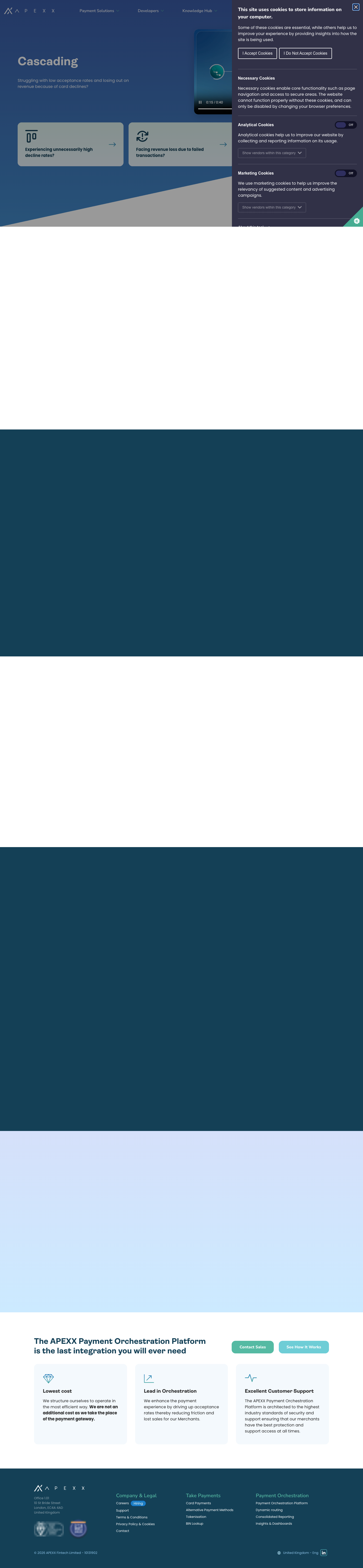
5 rows | The FAQ accordion row on bin-lookup, cascading, revenue-protect, smart-split, tokenisation | Component yes, surface no — light gradients are deleted from the palette, but the navy-on-light accordion variant is designed | Remap surface Point these five rows at Surface tint 1 #DCE2E6
(navy text 8.47:1) or tint 2 #F3F5F7 (10.13:1), then retire the option. No new design needed. |
Gradient Darkbg-gradient-dark · #144056 → #428AC9 |
1 row | Card Payments, final row (“Flexible Integration Options”) | Token yes, rules no — Gradient 1 survives, but with no content-safe contrast band | Remap to navy — reserve Gradient 1 for heroes/full-bleed. Evidence for the decision is in the screenshot below: the teal heading is 4.71:1 at the top of the row and 1.57:1 at the bottom. |
Greybg-light-grey · #f7f7f7 |
0 rows | Nowhere in flexipage content (the class appears only in CSS; grey is used by non-flexipage sections such as the footer help band) | Palette has cool tints instead | Remove If a light-tint band is wanted later, it comes back as “Surface tint”, not warm grey. |
Gradient Midbg-gradient-mid · #3B5CA7 → #428AC9 |
0 rows | Nowhere as a row. The same gradient is hard-coded as the hero background in HeroSection.styles.js |
No | Remove Keep it only as the hero token, replaced by Gradient 1. |
Gradient Neutralbg-gradient-neutral · #ddeef9 → #d4fdf4 |
0 rows | Nowhere as an editor choice — but hard-coded into CallToActionRow and used by the Panels row's
“Row Gradient White Panels” style |
No | Remove Depends on retiring the CTA and Panels rows (Table B); remove all three together. |
Gradient Extra Lightbg-gradient-extra-light · #ddf1ed → #e9f4fb |
0 rows | Nowhere. Also the default hero-CTA panel background token | No | Remove Repoint the hero-CTA panel to white or Surface tint 2. |
Proposed end state — four surfaces: White · Surface tint (replaces Grey and Gradient Light) · Navy · Gradient 1 (hero and full-bleed decoration only, not a content-row option). That removes four of eight CMS options, needs no new component designs, and cuts the token matrix from 8 surfaces to 3 content surfaces — which the proposed system can already fill once the semantic tier exists (§11.3.1).
Where the four live backgrounds appear
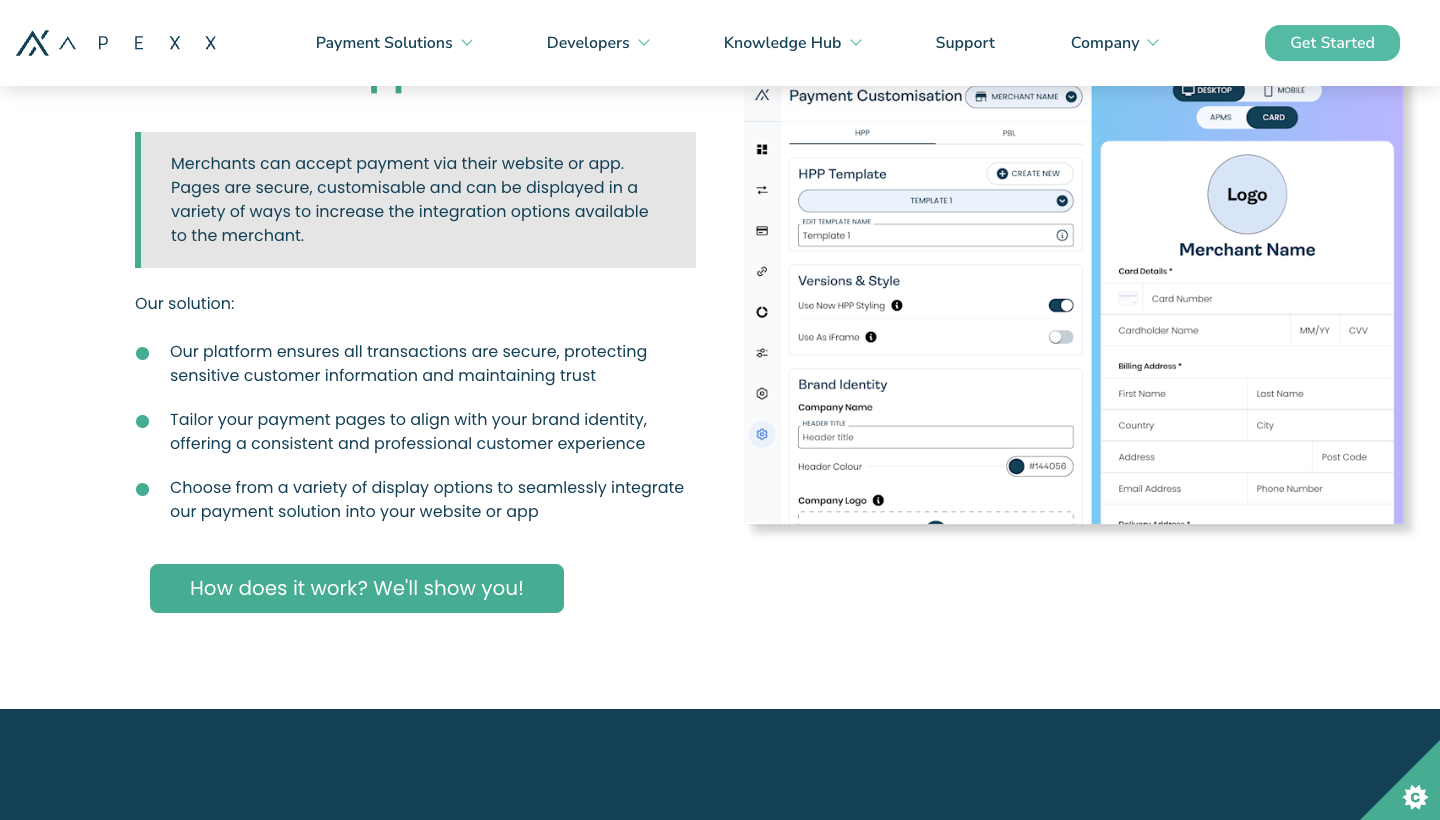
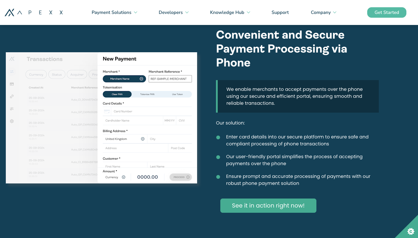
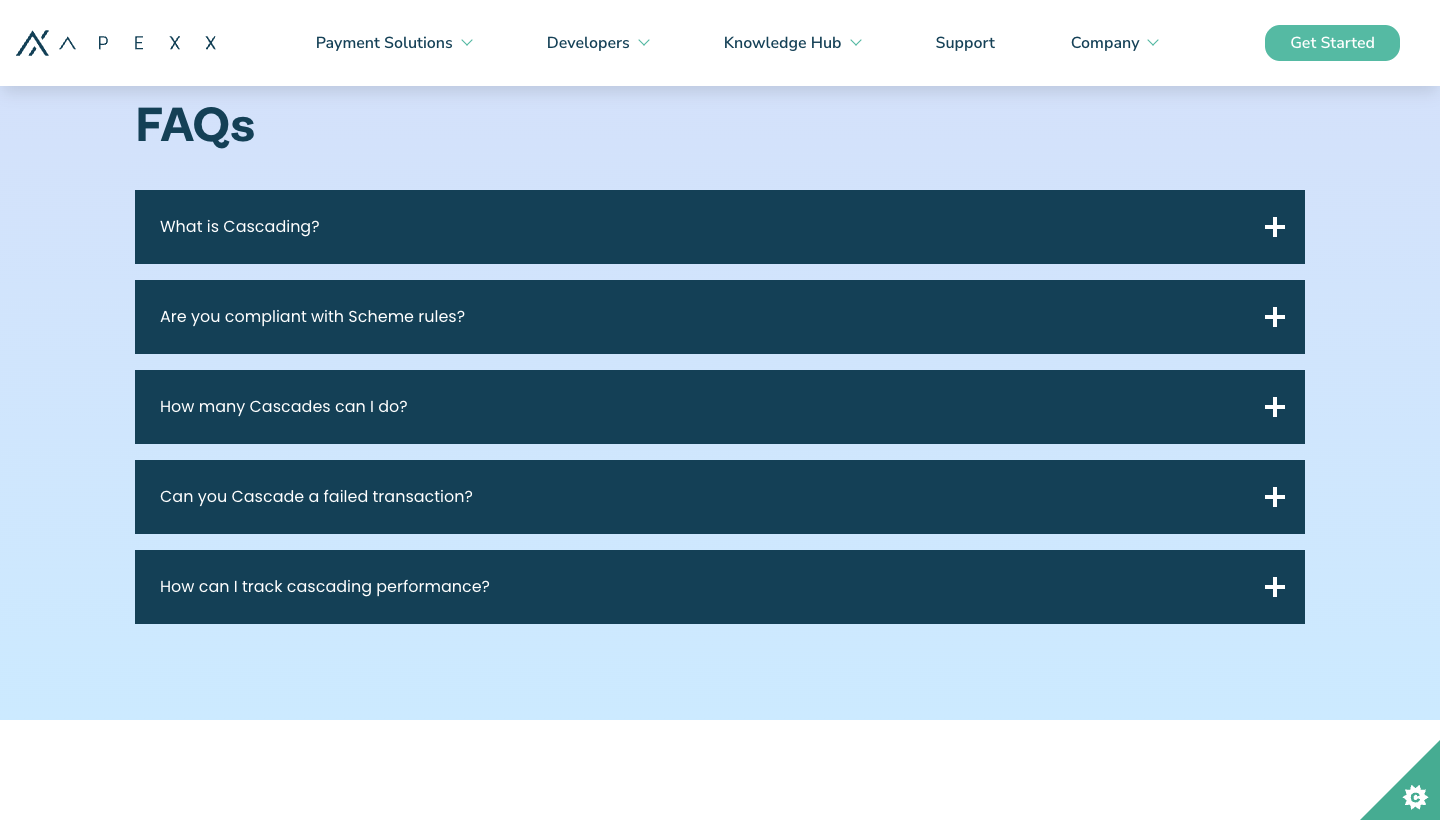
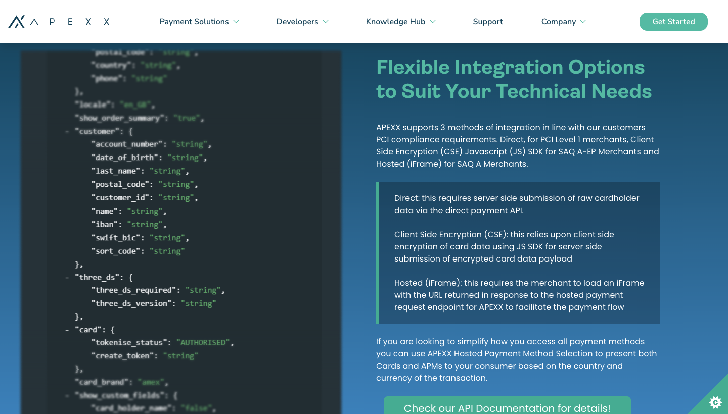
12.2 Table B — the eight row types (plus hero and rich-text elements)
Answer to “are all 8 rows used?” — no. Four are used, four have never been used in production.
| Row type | Used? | Where | New design? | Recommendation |
|---|---|---|---|---|
| HeroSection | 12 / 12 pages | Every flexipage | Desktop only | Needs design — tablet + mobile hero (the audit's own spacing defect), plus the hero-video, hero-icon and hero-panel-links variants that the CMS exposes. |
| AltRow (image/text split) | 39 instances | All 12 pages — the workhorse row | Yes — Split Content Section (48px gap, 570px image, tint box, no accent colours) | Has its design — build as specified. Confirm the multi-item alternating stack inherits the same spec. |
| AccordionRow | 5 instances | bin-lookup, cascading, revenue-protect, smart-split, tokenisation (FAQs) | Yes — light and navy variants, jade-light open header | Has its design — plus the surface remap from Table A. Intro-copy block above the accordion needs no more than body styles. |
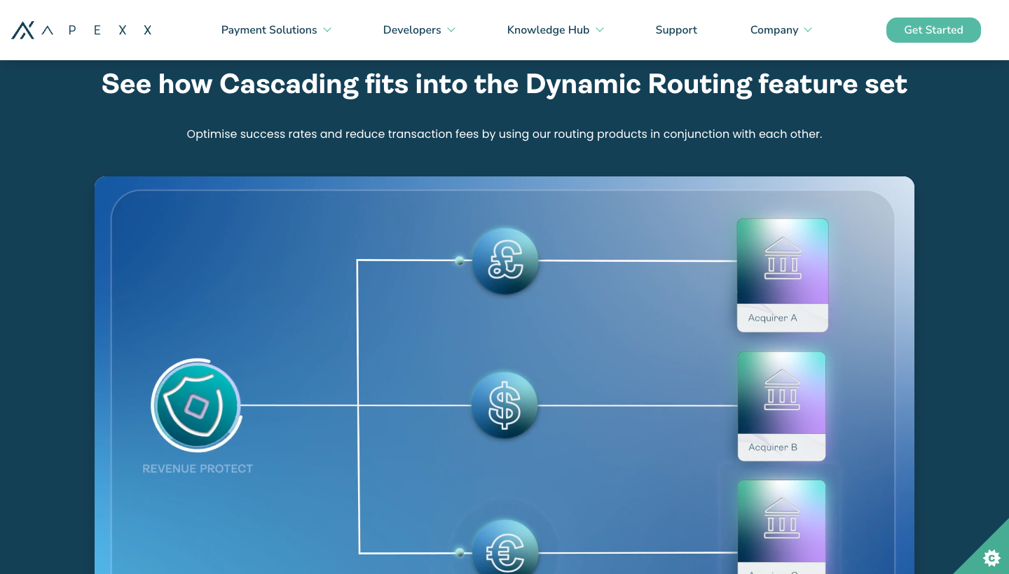
| CopyRow (rich text, centred or left) | 5 instances | cascading, revenue-protect, smart-split (centred on navy); payment-orchestration-platform ×2 (centred on white) | No | Needs design: centred text measure, inline CTA placement, and the rich-text elements it can contain (see bottom rows). |
| WidgetRow → Logos Map | 1 instance | Alternative Payment Methods (“Truly Global Processing Locally”, interactive acquirer/APM map + filter) | No — the APM redesign replaces it with a static logo grid | Decide + design: keep the interactive widget (needs a design incl. the select and ACQ/APM toggle) or accept the static grid as a deliberate feature removal. |
| WidgetRow → POP Diagram | 1 instance | payment-orchestration-platform | No | Needs design — the most complex interactive component on the site and the only thing on that page; it cannot inherit the two designed page patterns. |
| WidgetRow → BNPL Logos Slider | 0 | Never used | No | Remove |
| PanelsRow (2/3-col panels, 3 row styles) | 0 | Never used | Feature cards are the visual successor | Remove — if a panel grid is wanted later, rebuild it as Feature Cards, which are designed. Removing this also removes the “Row Gradient White Panels” style that depends on Gradient Neutral. |
| TestimonialsRow (carousel) | 0 | Never used | Case Card covers testimonial content, not the carousel row | Remove — drops the react-slick dependency from the flexipage bundle. |
| TwoColumnsRow (+ SubTitle ring ornament) | 0 | Never used | No | Remove — and with it the SubTitle ornament's per-surface tokens. |
| CallToActionRow (label + tagline + button) | 0 | Never used | The page designs end with a different closing-CTA pattern | Remove — then design the closing CTA (heading + primary/ghost pair + 3 benefit cards) as a new row if editors need it, since that is what both redesigned pages actually show. |
| Rich text — blockquote | 34 instances | Every page (the tinted “problem statement” boxes inside AltRows) | Partial — Split Content's “10% black / 10% white tint box” is effectively this | Confirm mapping, then it needs only per-surface tokens — no new design. |
| Rich text — bulleted lists | 191 instances | Every page (custom round teal markers) | No | Needs a rule: marker colour per surface. Teal markers conflict with “jade for buttons only”, so specify navy or cyan. |
Rich text — .large / .small buttons | 36 .large, 0 .small |
CTA links inside AltRow/CopyRow copy | No | Map to Primary/Ghost and remove the extra classes from the Bard toolbar, so editors can't create undocumented button variants (this is also what enforces the 19px-bold AA rule). |
| Rich text — tables (+ responsive card mode) | 0 | Never used, but fully styled with 5 tokens per surface | No | Remove — or keep the code and accept it is undesigned. Removing deletes 5 tokens × every surface from the matrix. |
| Rich text — embedded video | 0 | Never used in flexipage content (hero video is separate) | Imagery rule only: external host, never uploaded | Remove — no design needed either way. |
Score after these decisions: 2 rows build as designed (AltRow, AccordionRow) · 4 rows/widgets need design (hero mobile + variants, CopyRow, Logos Map, POP Diagram) · 5 rows retire (Panels, Testimonials, TwoColumns, CallToAction, BNPL slider) · 4 rich-text elements need a rule or a toolbar removal, not a design. That takes the “60% undesigned” figure in §7 down to four genuine design tasks.
The two used rows with no design
12.3 Late addition — /careers-page-test/
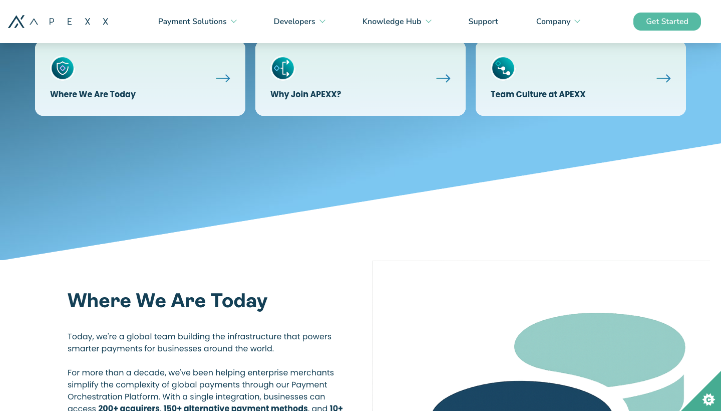
In scope and already counted in the tables above (it is one of the 12 flexipages), but it moved while this audit was being written — 3 rows at 15:26, 4 rows by 16:05 on 27 Jul — and it introduces four editorial patterns that appear nowhere else on the site and nowhere in the design system. Worth its own read before sign-off.
What it is structurally: hero (Gradient Mid + diagonal) with 3 hero panel links, then
4 × AltRow, all on white — no accordion, no table, no blockquote, no CTA button anywhere in the page body, and
no job-listing component (the repo's src/components/JobOpening is unused here). Page height 5,945px; the last two rows
are 1,140px and 1,426px tall.
| Pattern introduced | Detail | Design system position | Recommendation |
|---|---|---|---|
| Hero panel links (first live use) | 3 cards over the hero: gradient-filled circular icon, navy label, trailing arrow, on a pale mint card | Not designed as a component — but Feature card small (rectangle icon + bold title + trailing arrow) is nearly the same object; the two designed pages use exactly that treatment in the same position | Map to Feature card small — closes the hero-panel gap in §12.2 with no new design. Two conflicts to fix in doing so: the icons are gradient-filled (system says solid only) and the card surface is a pale jade tint (system says jade light is never a background surface). |
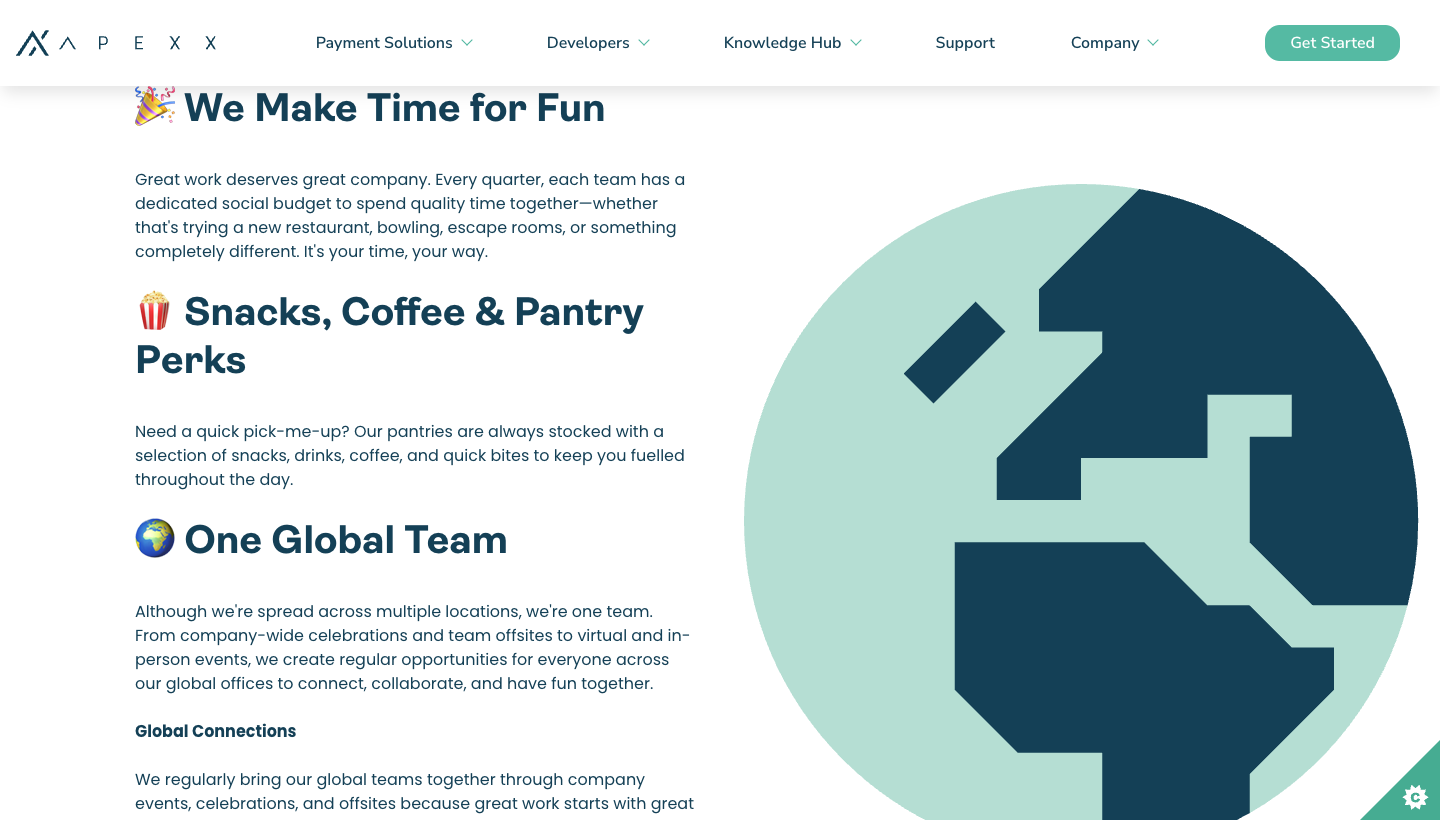
| Emoji as icons in headings | 10 of 15 headings are emoji-prefixed h3s — 🎉 🍿 🌍 💰 🏖️ ❤️ 🛡️ 👶 📈 | No — the Icons page states no library exists yet and that pictograms should be navy, cyan or a tonal variant | Remove — emoji render differently per OS, can't be brand-coloured, and are announced verbatim by screen readers (“party popper We Make Time for Fun”). Replace with the icon set once the icon workstream lands; interim, drop them and keep the text heading. |
| Long-form editorial column | Rows 3–4 stack 7–8 sub-headings plus paragraphs in one text column beside a single image; rows are 1,140–1,426px tall | No — Split Content is specified as one title + short copy + bullets against a fixed 570px image | Needs a rule, not a new component: either cap Split Content at one heading and split long content across rows, or add a documented “editorial column” variant. Also fix heading levels — the page has 14 h3s under a single h2, so the outline is flat. |
| Illustration style + assets | Flat navy-on-mint SVG illustrations (3), files named Untitled_design__1_.svg …; one raster
Retirement_Plan.png at 600×450 displayed 676px wide (upscaled) |
Imagery rules exist (crop, focal point, responsive sizes, no embedded text) but no illustration style and no mint in the palette | Needs a design call: is flat mint illustration part of the brand, or should these become photography/iconography? Also serve the raster at ≥2× or convert to SVG, and rename the assets. |
| No CTA in the page body | A careers page with no “apply”, “see roles” or contact action — only the global header button | Closing-CTA pattern exists in both redesigned pages | Content fix — add the designed closing CTA (heading + primary/ghost pair). This is the strongest argument for designing that closing block as a reusable row (see the CallToActionRow line in §12.2). |
-test slug is live and indexable |
Present in sitemap-pages.xml, real page title “Careers at APEXX Global | Join Our Team of Payments Experts” |
Out of design scope | Flag to content/dev — rename to /careers/ with a redirect before launch, or
noindex it. Not a styling issue, but it will ship as-is otherwise. |
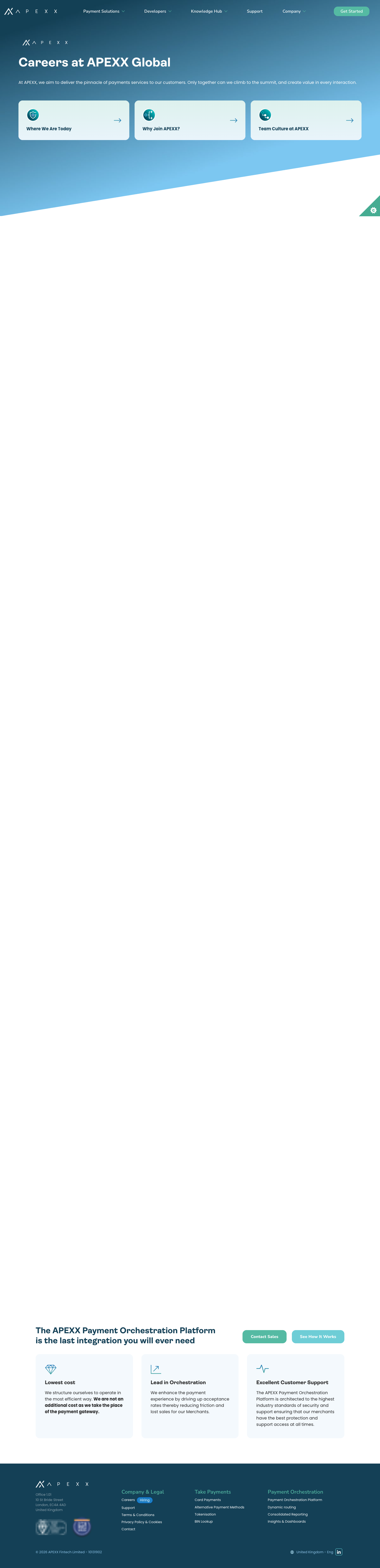
Process point. This page changed twice during a single day's audit, and it is the only flexipage inventing new patterns. Whatever is agreed from Tables A and B should be applied to the Statamic blueprint before more editorial pages are built this way — otherwise every new page adds undocumented patterns faster than the design system can absorb them. The row and background counts in this document are a snapshot dated 27 Jul 2026; re-run the parse (§14.5) at sign-off.
13. Recommended actions
Sequenced to slot into the Implementation Plan's phases rather than replace them. Items 1–5 below are the plan's “Next Steps” list extended with the three decisions it doesn't currently ask for (rows, widgets, blueprint).
Decisions needed from APEXX / the designer (blocking)
- Correct the stack assumption in the plan (no Antlers/Blade; Gatsby + styled-components + headless Statamic) and re-baseline the Phase 0/2 estimates on that basis — plus the plan's own three open items: nav-background rule, executive-headshot treatment, container max-width.
- Background reduction — sign off Table A (§12.1). Retire
Grey,Gradient Mid,Gradient NeutralandGradient Extra Light(zero production usage), remap the fiveGradient Lightaccordion rows and the singleGradient Darkrow, and reserve Gradient 1 for heroes. End state: White · Surface tint · Navy · Gradient 1 (decorative). - Row reduction — sign off Table B (§12.2). Retire
PanelsRow,TestimonialsRow,TwoColumnsRow,CallToActionRowand theBNPL Logos Sliderwidget (zero production usage); commission designs only for the hero's mobile/variant cases,CopyRow, and the two live widgets. - Widgets. Decide whether the Logos Map and POP diagram survive; if they do, they need designs, and if they don't, the APM/POP pages need replacement content.
- Fonts. Confirm Poppins-headings / Nunito-body, and that Ambit is being dropped.
- CTA colour. Jade
#3F9B83+ mandatory 19px-bold, or jade-dark#317866for robustness.
Then, in build order
- Token layer first. Rewrite
FlexipageStyles.jsas: primitives (new palette) → semantic tokens (--color--paragraph,--color--headings, …) → 4 surface blocks. Keep the existing custom-property names so row components need no changes. Delete theteal600/teal800duplicate. - Typography. Replace the
headingSizesmap with the new scale, add the tablet tier at the documented breakpoints, subset and preload Poppins 600/700 + Nunito Sans 400/500/700, remove Ambit. - Buttons. One component with the 5 states; map
.large/.smallrich-text classes onto primary/ghost or remove them from the Bard toolbar so editors can't produce undocumented variants. - Statamic blueprint. Prune the
background_colouroption list and any retired sets in the same release as the CSS, otherwise editors can still select combinations that no longer have styles. - Undesigned-but-surviving elements. Derive tables, blockquote, lists, subtitle ornament and hero-panel styles from the new tokens and get them signed off as additions to the Figma file, so the system stays the source of truth.
- Global chrome + mobile hero. Implement nav-matches-hero and fix the mobile hero spacing defect the audit flags; re-check every template, not only the designed ones.
- Regression pass. Contrast-audit the four surfaces (automated), then screenshot-diff the 12 flexipages plus the calculator/blog/contact templates, which no design covers.
The efficient sequencing insight: because only 4 of 8 backgrounds and 4 of 8 row types are used in production, the cheapest credible path is constrain first, then implement. Constraining converts most of the “missing design” findings in §7 from build blockers into deletions. Done before the plan's Phase 0, it also shrinks Phase 2 and Phase 3.
Three additions that would make the plan complete, in priority order: (1) a semantic + per-surface token tier on top of its primitive palette (§11.3.1); (2) the flexipage rows added to the Phase 2 component list, or an explicit retirement decision for the four unused ones (§11.2); (3) a Statamic blueprint task in Phase 3 so CMS options and CSS ship together. Everything else in it can proceed as written.
14. Appendix: evidence & screenshots
Figma captures were taken at 100% zoom (anonymous view). Live captures at 1440×900 (full-page) and 390×844 (mobile).
14.1 Proposed system — foundations
14.2 Proposed system — components
14.3 Website audit page
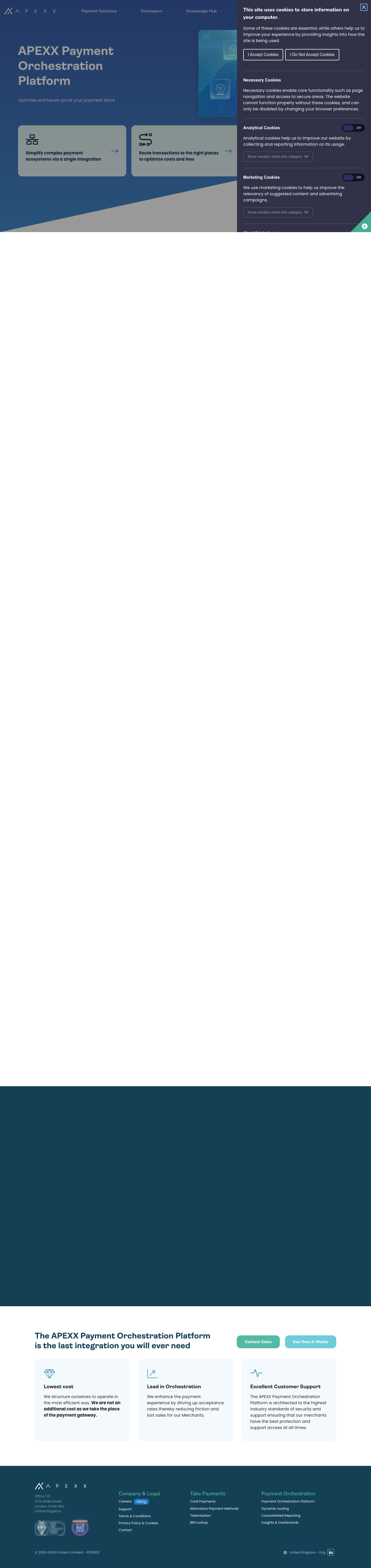
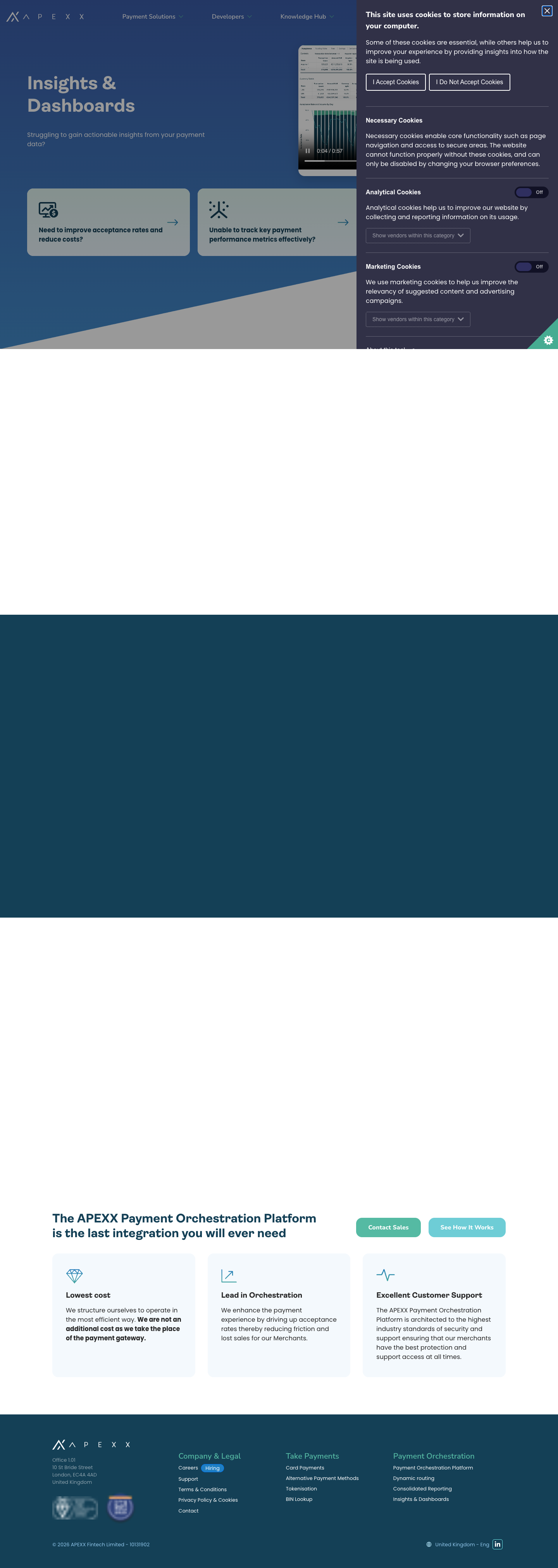
14.4 Live site today
14.5 Production row/background inventory (parsed from live HTML)
| Page | Row sequence (type · background) |
|---|---|
| alternative-payment-methods | AltRow · white → WidgetRow · logos-map → AltRow · white → AltRow · dark-blue |
| bin-lookup | AltRow · white → AltRow · dark-blue → AltRow · white → AccordionRow · gradient-light |
| card-payments | AltRow · white → AltRow · dark-blue → AltRow · white → AltRow · gradient-dark |
| careers-page-test (newest page — see §12.3) | AltRow · white ×4 |
| cascading | AltRow · white → AltRow · dark-blue → AltRow · white → CopyRow · dark-blue centred → AccordionRow · gradient-light |
| consolidated-reporting | AltRow · white → AltRow · dark-blue → AltRow · white |
| dynamic-routing | AltRow · white → AltRow · dark-blue → AltRow · white |
| insights-and-dashboards | AltRow · white → AltRow · dark-blue → AltRow · white |
| payment-orchestration-platform | CopyRow · white centred → WidgetRow · POP diagram → AltRow · white → CopyRow · white centred → AltRow · dark-blue |
| revenue-protect | AltRow · white → AltRow · dark-blue → AltRow · white → CopyRow · dark-blue centred → AccordionRow · gradient-light |
| smart-split | AltRow · white → AltRow · dark-blue → AltRow · white → CopyRow · dark-blue centred → AccordionRow · gradient-light |
| tokenisation | AltRow · white → AltRow · dark-blue → AltRow · white → AccordionRow · gradient-light |
Totals: AltRow 40 · CopyRow 5 · AccordionRow 5 · WidgetRow 2 · PanelsRow 0 · TestimonialsRow 0 · TwoColumnsRow 0 · CallToActionRow 0. Backgrounds in use: white 29 · dark-blue 14 · gradient-light 5 · gradient-dark 1 · grey 0 · gradient-mid 0 · gradient-neutral 0 · gradient-extra-light 0. Rich-text elements in use: blockquote 34 · unordered lists 191 · tables 0 · embedded video 0.